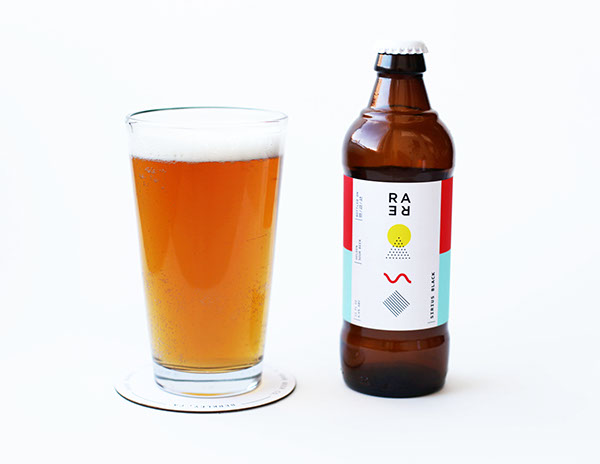
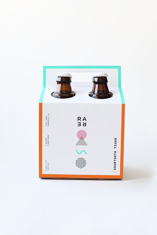
We’re excited to see another great packaging design project from one of our favorite young up-and-comers, Mackenzie Freemire. The Chicago-based graphic design undergrad has a spot-on sense of color, pared-down aesthetic, and predilection for geometric forms that really scratches our design itch. And we think her latest output for Rare Barrel brewery might just be her best effort yet.
The Berkley, California microbrewery specializes in sour beer, which has an intentionally tart taste (think Belgian brews like lambics) achieved through an open-vat, wild-yeast fermentation process that often yields surprising and “funky” results–but we’re kind of into that. Plus, it’s tough to find a sour beer brewery this far from Brussels, so kudos to Rare Barrel on their endeavor and aptly named operation.
Freemire’s label is fittingly unique–we challenge you to find anything in even your most special of speciality shops that looks anything like it. The light color palette and playful shapes exude the company’s experimental vibe while also grabbing the attention of discerning beer drinkers–and design lovers–this side of the Atlantic.