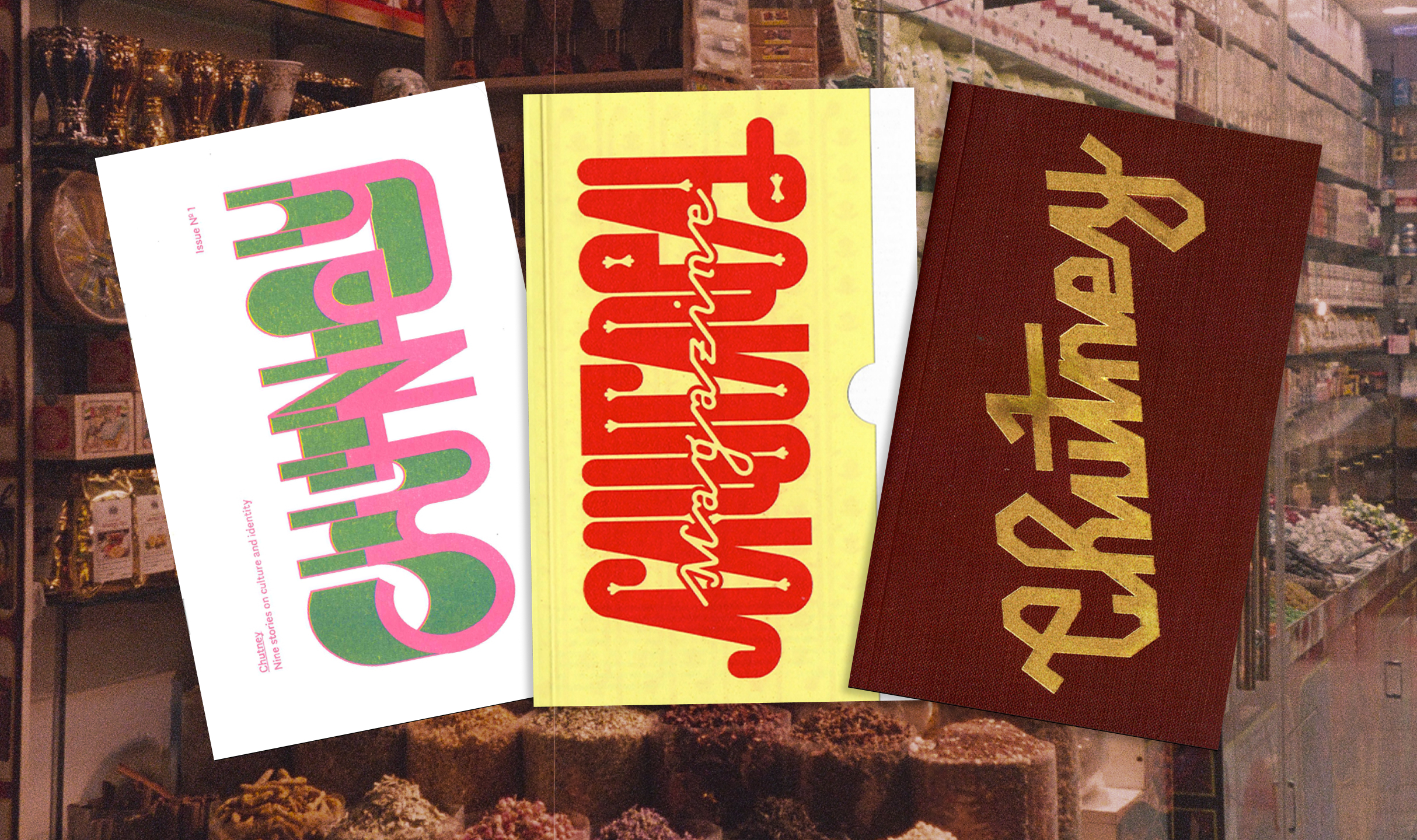
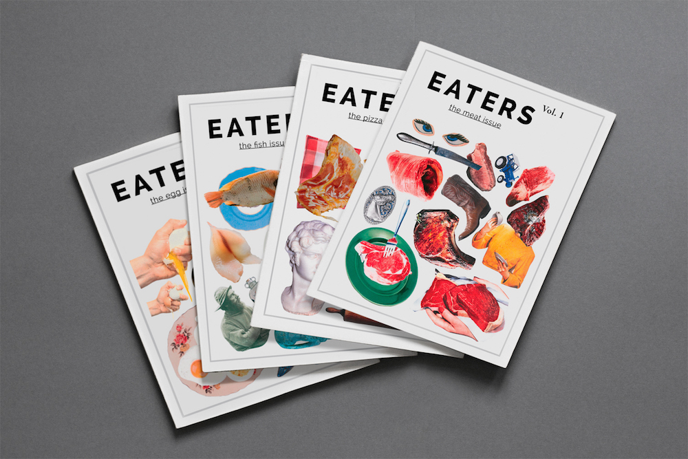
The world of food is pretty open to notes from the underground: besides cheese caves and wine cellars, there’s underground supper clubs and the “raw milk underground.” But what about an underground food magazine? This Friday, Washington, DC residents will have an opportunity to peruse EATERS, an underground food magazine operating in the DC area. With no website or online presence, the team behind EATERS is launching tomorrow with their first four issues and a publicity strategy that leverages printed materials and good ol’ word-of-mouth to help spread the word. Curious? As Greg Katz, founder of EATERS told MOLD, “EATERS unites a love for food with art and literature—all of which are vibrant in DC right now. The contents include poems, written pieces, recipes, ideas for recycling food packaging and features of local people in the food industry.”
To celebrate the launch, MOLD spoke to Jessika Tarr, the Berlin-based, multi-talented cover artist responsible for the collaged identity of the first four issues of the magazine. With a broad artistic practice ranging from quirky, layered illustrations to figurative paintings that have a dark yet playful element, her process explores how “play and experimentation are vital to creating progressive and exciting imagery.” We talk to Jessika about her food-related design work, her favorite Berlin haunts, and “the big salami.”
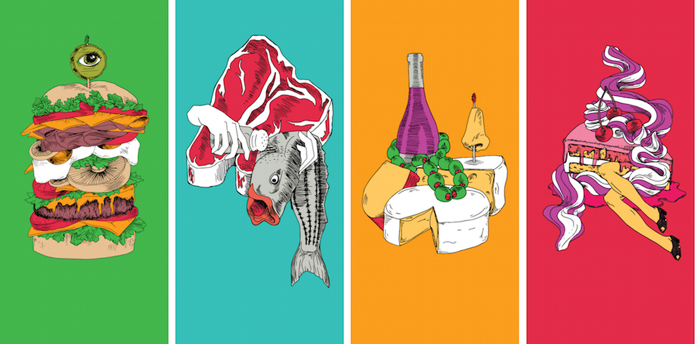
MOLD: You’ve done illustrations and art direction for a variety of food-related projects—chocolate bar packaging, grocery store advertising, and editorial covers. How is working with food different than working with other clients? Does it change your process/approach?
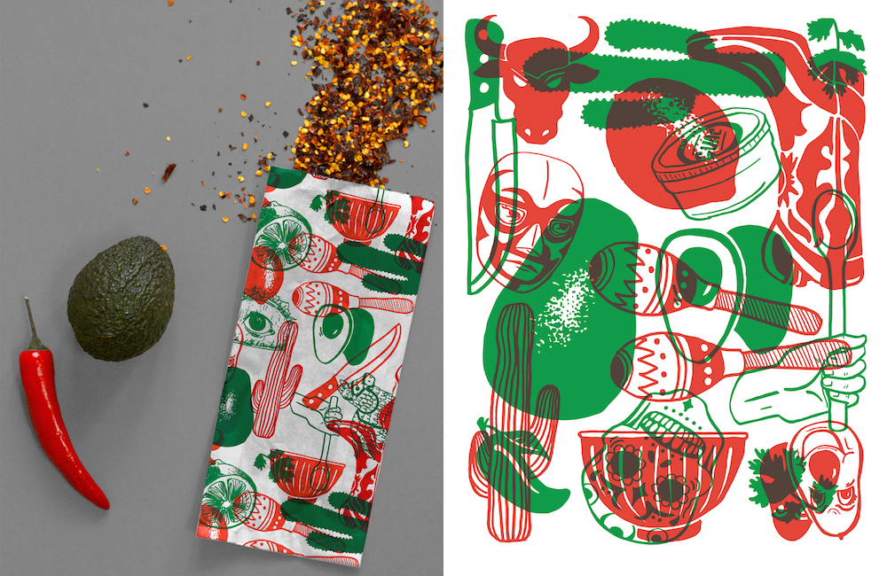
Jessika Tarr: When I first began working on food-related design projects, I imagined that the aesthetic boundaries may be tighter or more sensitive due to a desire for appetizing imagery. What I discovered, however, is that food is not only more fun than many other subjects, but that the rules of beauty are possibly more liberal. For example, when I designed some guacamole-inspired patterns for the homegrown company, Capital Canche Guac, I was able to marry some quirky drawings with my ingredient illustrations. Though some of the playful imagery did not relate directly to food, they brought new context and energy to the food elements. Eating is an extensive element of life and I think its breadth as a subject allows for endless design possibilities and play.
You’re bi-cultural, growing up in both California and Germany and spending time in Washington DC (that makes you bi-coastal too!). What are some of the elements of visual culture from these places that have shaped your work?
Each location was, fortunately for me, beautiful and diverse in it’s terrain and culture. As a child in Germany, I was stirred by the colors and narratives rich in 19th century book art, especially dark cautionary tales such as Der Struwwelpeter. California provided me exposure to sun-bleached pastel color palettes, as well as a laid back atmosphere in which I could experiment with my artistic passions before moving to the East Coast to attend The Corcoran College of Arts and Design. While in Washington, DC, I began my career as an artist and designer and had opportunities to immerse myself in the city’s lively creative community.
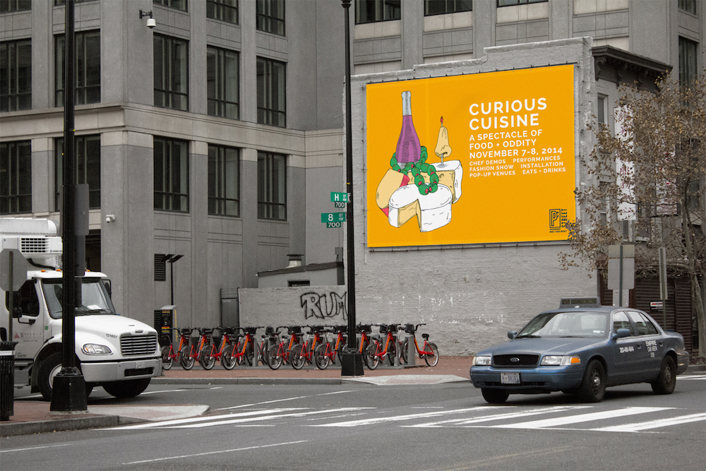
Last November, I carried out a design campaign for Whole Foods Market that allowed me to become a visual part of the city in a more literal way—I designed a variety of posters and banners for a local foodie event that were displayed in the Metro system, on city walls and over abandoned windows. Seeing my work united with the fabric of this familiar city that had inspired and shaped me over the last seven years was rewarding and, as they say, “big salami” (full-circle).
Food is not only more fun than many other subjects, but that the rules of beauty are possibly more liberal.
Can you talk about the process for designing the covers for the new EATERS Magazine? What were some of your considerations? Why did you decide to go in the direction you chose?
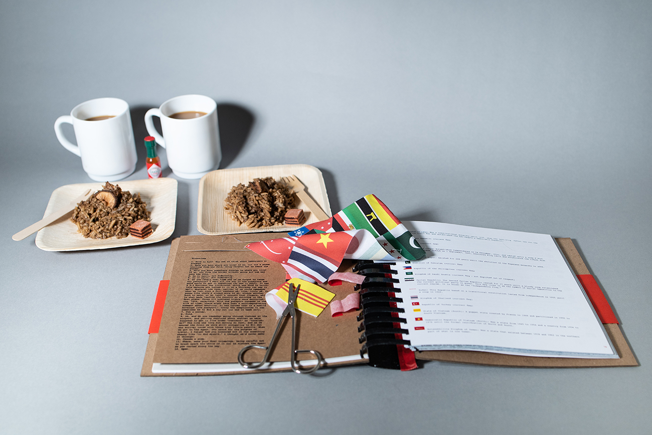
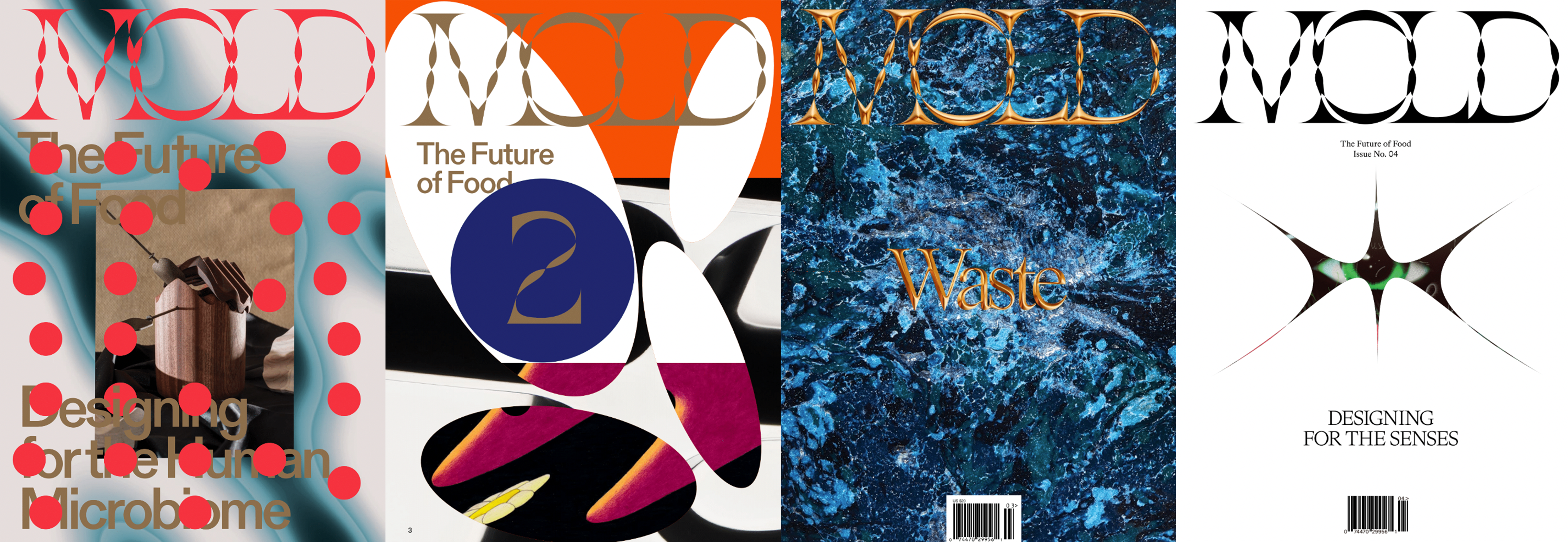
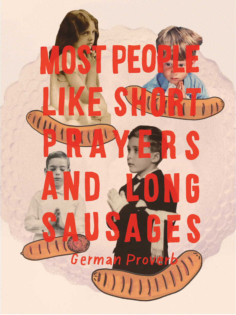
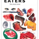
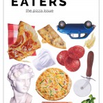
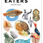
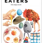
Working with EATERS Magazine was a delight for many reasons, one of which being its newness as a publication which allowed me the freedom to visually brand it. My main consideration was merging the unconventional feel of the magazine with a more classic publication style as I felt they would, together, achieve a balanced look with room to metamorphose over time. The collaged look came about through lengthy (and fun) experimentation and involved many hours of cutting out old magazine clippings, staging my own photo shoots, and tweaking the layout of the final collage into an organized chaos.
You recently moved to Berlin—can you recommend some favorite places (retail, restaurants, cafes, bars, bookstores, etc) that represent Berlin’s food design culture?
Berlin is overflowing with delicious eats and fun hangout spots. I have many more on my to-visit list but here are a few I am loving so far:
1) KASCHK: A bar with great drinks, shuffleboard tables, and a stash of board games
2) Tibet Haus, Kreutzberg: Heavenly Tibetan eats that cost close to nothing
3) Wohnzimmer Café + Bar: Beautiful drinks like the Edelweiß Cucumber Spritz in a series of 20th century-style living rooms
4) Sarah Wiener im Hamburger Bahnhof: If you attend an art opening at the stunning Hamburger Bahnhof museum, the café attached to it (no stale museum food here!) will be hopping until the morning hours with art folks
5) Kimchi Princess: A hip spot with Korean dishes that always hit the spot
6) Café Morgenrot: A happening brunch destination that features a vegan/vegetarian German spread every weekend
7) Facciola Berlin: A lovely wine selection and lots of fun events, like an avant-garde mini opera I recently attended there
8) Melita Sundsrtöm: A combination bar/café/library…three of the best things together
Who would be a dream client and why?
My list of clients with whom I’d love to work is long! A quality I admire in a client is a spirited yet clean aesthetic and two food-related products I would love to design someday are beers and hot sauces, perhaps because both are known to be visually mischievous. With that being said, my dream client would be TASCHEN Books despite the fact that they do not make beers or hot sauces. I enjoy the diversity and ingenuity of their book designs, love the contents of their publications, and am continuously enamored by their audacious visuals.
Readers in DC can find copies of EATER at a variety of locations including Mess Hall, Union Market, Salt & Sundry, and Miss Pixies.