Next time you survive Ikea, skip celebrating with cinnamon buns—grab some creamed fish roe for a lesson in Scandinavian food packaging, instead. You’ll find yourself holding a royal blue metal squeeze tube of Kalles kaviar. Don’t confuse this kaviar-with-a-k with upmarket caviar. The iconic salty-sweet Swedish spread is made from low-grade cod eggs compressed with sugar, canola oil and flavorings. Not only is the flavor a nostalgic favorite for Swedes—the toothpaste-like tube is also iconic.

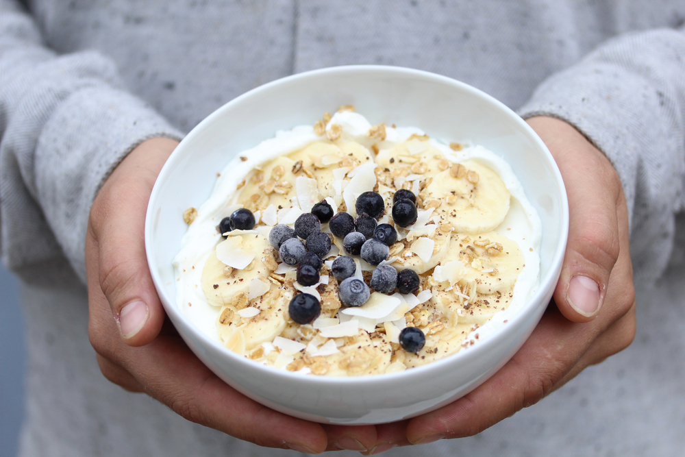
Swedes love creamed fish pate and food in tubes. Kalles dominates Sweden’s fish paste market, but other companies offer their own fishy spreads, which are invariably packed in tubes. The tube’s popularity offers more than just easy identification; they offer preservation, tradition and, potentially, branding. An air-tight seal lets consumers rotate between tubes of Kalles, Abba anchovy paste and Tine brunost cheese without worrying about unpleasant odors or spoilage. In addition, now that the tube is an instantly identifiable package throughout Scandinavia, it provides a sense of social unity; even upmarket restaurants poke fun at it with inventive platings. Companies have realized the tube’s popularity and now put everything from vegetarian pate to cheese into a humble squeeze container.
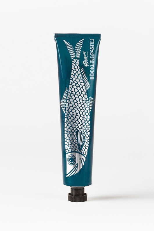
This also means that brands must work harder to distinguish their product from the other identical containers lining supermarket shelves. While Kalles created a much-loved character in their trademark smiling blond boy, other companies use stylized images to identify their market niche. Biggans’ recent rebrand of their blöcklingpastej (herring paste) demonstrates how graphic design lets the company target consumers looking for something beyond the mild, mass-market Kalles.
Founded in 1952, Biggans is a family-owned company that manufactures a variety of food in tubes. They’re most well-known for böcklingpastej, a pate made from smoked, creamed herring. Before a rebranding from the Swedish studio Bedow, the pate came in a tube featuring the product and company name on a pearly white background. They replaced the words with a large, graphic depiction of a herring on a metallic teal background. On the opposite end from the nozzle sits the company and product name in a vintage inspired font. Retaining the brand’s iconic script in the corner reinforces Biggans’s history—they may reimagine how their product looks, but their identity continues to hinge on their enduring commitment to quality.
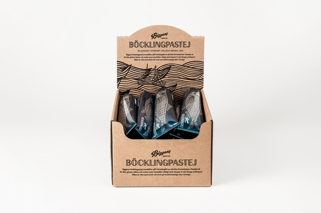
The switch from words to imagery allows Biggans to emphasize their ingredients—unlike Kalles’s salty-sweet flavor, consumers can expect to taste fish when they buy Biggans. With clean lines and bold graphics, the fish appears both retro and modern. While Kalles might woo adult consumers with memories of happy childhood breakfasts, Biggans doesn’t present retro as nostalgia but rather as an alternative sensibility. The fish’s eyes stare down the customer and there’s an almost bemused grin on its face. People buying Biggans are okay with eating fish—they aren’t kids who squirm at slimy herring.
Biggans’ rebrand for their iconic blöcklingpastej demonstrates how a company can retain a strong brand identity while identifying with the mass-market. Their graphics appeal to a more mature consumer, identify their unique flavor, and illustrate their heritage. It will be interesting to see if other companies choose to reimagine their tube design following Biggans’ change.