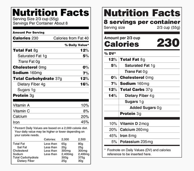
Few people would recognize the United States’ Nutrition Facts food label as the most reproduced design of the past century but a peek inside any American pantry would undoubtedly include at least one of the 700,000 food products currently on store shelves touting the label. Earlier this month, the Food and Drug Administration (FDA) and First Lady Michelle Obama revealed an overhaul of the ubiquitous design icon, calling for a standard 90-day public review for the proposal. The feedback for the proposed redesign of the FDA Nutrition Facts food label is a fascinating conversation around the efficacy of infographics and the power of communications design.
The iconic Nutrition Facts label was first designed in 1994 by Burkey Belser—who also designed the energy guide that appears on appliances and the drug-facts panel on medicines. In an interview with the Washington Post, Belser calls the project, “the best project I ever did. I don’t know if anybody’s heart beats faster when they see nutrition facts, but they sense a pleasure that they get the information they need.” The original label emphasizes simplicity with its use of Helvetica and left and right justified text. “There’s a harmony about it, and the presentation has no extraneous components to it…There was no grammatical punctuation like commas or periods or parentheses that would slow the reader down.”
 Belser’s Nutrition Facts label as inspiration for Jeremy Scott’s Fall 2014 Moschino presentation.
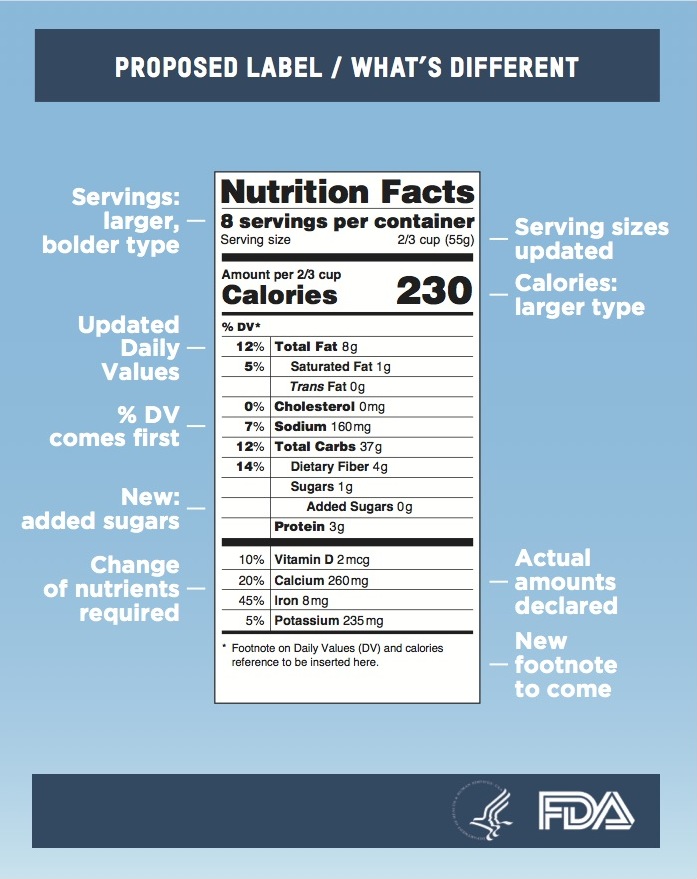
Fast-forward 20 years, and the FDA’s brief for the redesign reflects the shifting values and relationships Americans have with their food. Tapping designer Kevin Grady, Design Director at IDEO Boston and EIC/Founder of Lemon magazine, the proposed label replaces out-of-date serving sizes to better align with how much people really eat, highlights key parts of the label such as calories and serving sizes, includes a new line item on added sugar, and mandates information on potassium and Vitamin D—both which are considered key to preventing certain chronic diseases. The emphasis on preventative nutritional health is projected to provide more than $30 billion in economic benefits, including reduced health care costs.
In an interview with Politico, Grady shared some insight on his design process. Employing a user-centered design process, Grady framed up his end-user as, “a mom who had a screaming baby, or an elderly person, or perhaps a diabetic person with eye issues.” The enlarged calorie count and boldfaced servings per container information are easy callouts for anyone to see and understand. Shifting the Daily Value percentages to a left column separated by a vertical line also prioritizes the information on the newly streamlined label.
Belser notes that the design uses boldface type and scale to emphasize government recommendations. “As soon as we bold something, that’s a public-policy decision. In the old label, you boldfaced fats. In the new version, calories.” Adding to the conversation, Belser sees the new label as more prescriptive, “I believe the alternative label should not be called ‘nutrition facts.’ It should be called ‘nutrition guide.’ It’s moved that far along the continuum because of the design.”
Although not everyone is happy with the redesign, Bonnie Siegler, Stefan Sagmeister and Tobias Frere-Jones weighed in on the side of the redesign in their comments to FastCoDesign lauding the new hierarchy of information, simplicity and calorie callout. As Siegler noted, “I think the scale adjustments make lots of sense. The Nutrition Facts headline used to be the largest single item, now the largest piece of type is the number of calories. That huge number is simply unavoidable now. I also like that the number of servings per container is much bigger. That small hidden number has always been a way to kid yourself into thinking you’re not overeating.”
CNN reported that, “A USDA study released last month showed 42% of working-age adults between 29 and 68 looked at these labels most or all of the time when shopping. Some 57% of Americans older than 68 did as well. That’s up from 2007, when 34% of working-age adults looked at the label, and 51% of Americans older than 68 did. The increase is good news as the United States struggles with an obesity epidemic. Some studies have shown that people who read labels eat healthier. More than a third of all Americans are obese, according to the Centers for Disease Control and Prevention.”
The FDA is betting that legibility and a shift in information will change consumption for the better. The label redesign will cost the food industry about $2 billion to implement. That’s a small price to pay for the expected positive health impacts the FDA is designing towards.
