Read more from In Service, our monthly look at the future of hospitality from innovators around the world.
Amy Morris and Anna Polonsky, co-founders of design studio The MP Shift, are fast becoming the go-to outfit for transforming earnest hospitality ideas into cohesively derived destinations. Like a pair of restaurant whispers, they eschew a signature style and instead work in the bespoke, listening to their clients’ unique hopes, dreams and concerns to deliver a full package concept that covers all aspects of a launch, from branding to interiors and any creative needs in between.
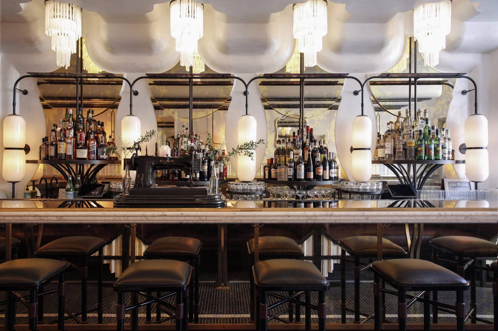
 The interior of De Maria, a vegetable-forward, casual restaurant in New York’s SoHo neighborhood, designed by The MP Shift. Photo by Heidi’s Bridge.
The MP Shift’s interior design and branding efforts are behind NYC hotspots like Acme, Lalo and De Maria as well as projects like Small World—a Google Translate pop-up that brought together 18 chefs from different pockets of the world to cook native foods and non-English-speaking servers so diners would need to use the app to order. Their ability to so seamlessly diversify piqued MOLD’s curiosity. We reached out to learn more about this dynamic duo’s design ethos.
 Portrait of Amy Morris and Anna Polonsky by Teddy Wolff
MOLD: When did you open your studio?
The MP Shift: Two years ago, December 2014.
How big is your team? What are people’s roles?
We were inspired by the Huffington Post model: we have a core team of six right now and then we have another six perm-lancers around the globe that work with us. This allows us to have work moving forward 24/7.
The MP Shift is half creative team—graphics to interior design—and the other half is project management and business development.
What sets your approach apart?
In the past, we have both found that when you ask a chef or restaurant owner to tell you about their brand, it’s usually just a seed (healthy fast casual, latin food, wine spot, etc.). Rarely is the concept fully formed and thought through. So we wanted to help develop that seed into a verbal and visual concept, then design the brand identity and interiors, and finally make sure the concept is communicated and activated adequately so when the place launches the story can grow organically and cohesively.
The reason why we partner with our clients at every step of the process (from imagining the restaurant to opening it) is because we believe owners’ vision should be reflected the same, thoughtful way at every level, from the business cards to the floor tiles through Instagram or events—that’s how you make an impact in a crowded market.

 Interior design and branding for Verde, a New York salad cafe, by The MP Shift. Photos by Heidi’s Bridge.
How do you spend most of your time?
We love what we do so our work often mixes with our personal life but we always look for balance. Our days are a mix of time with our team and clients, eating out and design research, mixed with a balance of life—time with our husbands, yoga and traveling. Life balance is key to us and we encourage our employees to make it a priority as well.
How would you describe your design ethos?
We aim to articulate our partner’s vision into the space. If we’re successful the space should feel like it’s been a local favorite for a long time. The MP Shift is always thinking about how we can weave a bit of imperfection into the design, to make the space feel lived in and expressive.
 A diverse group of NYC-based chefs from restaurants including Mission Chinese, Maharlika, La New Yorkina, Pok Pok, Lalito and more cooked a multi-cultural meal for non-English speakers to encourage the use of the Google Translate app.
What is most important to you when defining a project? What are the first steps in your design process?
We always start our projects with a brand Q&A. This allows us to really understand the client’s vision. The closer we are to the client’s vision the more authentic the design. We collaborate with our clients to bring them a design true to their dream, without trying to be trendy or expected. We engage in constant communication with the client and remain rational.
What is the most significant design element that affects how people feel about food?
True to our approach we don’t believe ONE element is a driver. It’s the overall package. The most overlooked element is brand positioning. We often have people tell us they don’t need brand positioning but it informs everything.
 The bathroom sanctuary at De Maria features a glowing Virgin Mary.
How has social media affected your work, or does it?
Social media is a powerful marketing tool. It’s brought us clients and our best employees. We privilege quality over quantity; for us, the priority is to get followers who actually care about our content and will react to our work. That’s why we take time to create serious content, not just like-able food porn; we took a different approach to our Instagram, creating a real Insta-zine. Weekly we research a design theme and share our findings with our followers. It creates a catalogue of knowledge for us and our followers and inspires designs.
What’s your most unusual source for inspiration?
As any creative will tell you, inspiration comes from everywhere. When our team gathers for a brainstorm we welcome all ideas because sometimes it’s the most off-beat idea that sparks the best idea.
 Brooklyn cafe and brunch favorite, Tilda All Day, designed by The MP Shift.
Whose work makes you wish you’d thought of that?
The iPad has it all and is brilliant from A-Z, the full package; a mix of design, functionality and entertainment. Or the Eames molded plywood chair. It’s timeless, iconic and elegant.
How do you envision the future of restaurant design?
With rents being so high in New York, it is unfortunate to see most restaurants copy other restaurants, people are terrified to be different. We’re hoping that will evolve in the future as a distinct design and personality is what will make one be successful.
On our end, we’re always trying to stay ahead of the trends and create something unique for each client. Currently, Tambour and Terrazzo are making big splashes in design so we’re looking for a new material that will draw people into our spaces. We’re also always trying to find ways to be more efficient; the processes for design need to evolve. We keep looking for better tools for storing images and resources, organizing projects, creating mood boards.

