The term “food design” can often be confused with glamorous fine-dining or the latest packaged good gimmicks of corporate food giants. There are, however, instances where the design of food must be as considered, complex and unsuperficial as that of medical equipment or urban infrastructure—where function prevails over fashion. Case in point—the military food ration.
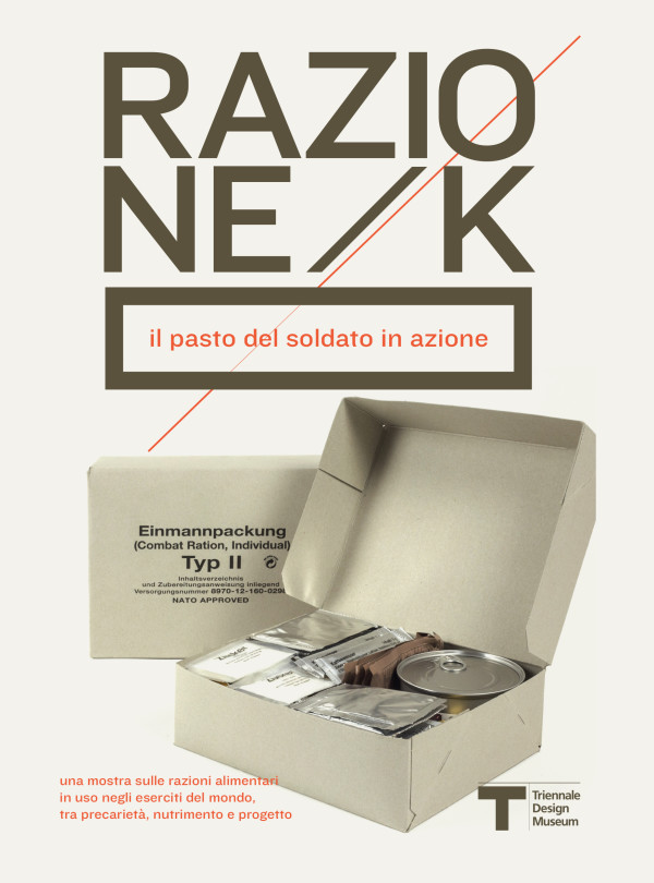
Opening today at the Triennale Design Museum in Milan as part of the Expo Milano 2015—Feeding the Planet: Energy for Life, a new exhibition curated by industrial designer Giulio Iacchetti will display the food rations of 20 nations in a reflection on the egoless and frivolity-free expression of functional food design. Entitled K-Ration: The Meal of a Soldier in Action, the show explores food design at its most critical to human survival, and may indeed be one of the most authentic case studies in world design—the varying ways in which nation’s armies respond to strict parameters of size, weight, color, materials as well as energy and calorie efficiency being a truly fascinating insight into international food and design identity (see the line-ups below)
‘a well-equipped, well-fed soldier is hard to beat’ -T.E. Laurence
In the exhibition’s catalogue, Iacchetti’s opening statements reflects on the similarity of the military ration to the Japanese art (design classic?) of Bento, the graphic quality and effectiveness of the rations (that have never seen a graphic designer) and the inspiration these designs could represent to the future of feeding the planet. We caught up with Giulio ahead of the opening.
K-Ration: The Meal of a Soldier in Action is on view now through February 22, 2015 at the Triennale Design Museum in Milan.
Sam Dunne: So Giulio, where did the idea for the exhibition come from?
Giulio Iacchetti: I have always been interested in food design, but with a more tangible design—things that have purposes and real functions, where there’s limitations related to the small size, weight, adequate calories and protein. Frugality can often lead us to realize solutions with real charm.
Which country’s ration strikes you as being the best designed?
New Zealand’s is a ration with a strong graphic impact—and the color palette of different packages that makes it extremely cool. The Italian one though has a very accurate outer packaging. I like that it has three small boxes dedicated to the three meals of the day.
What was the most surprising/interesting thing you discovered?
The Dutch ration looks like it could feed four people! By contrast, the Thai ration is extremely small—just a portion of rice and two cans of meat.
What can we hope to takeaway from coming along to see the exhibition?
It’s amazing to see how the same design theme [food rations] can be dealt in a so many different ways. From this exhibition, we can catch tangible expression of different cultures like, diets, attention to detail etc. etc.
What could food designers learn from rations?
We talk too much about food design as a phenomenon linked to glamorous, formal aspects, which is the predominant aesthetic factor. With this exhibition I want to highlight the significant operation that it is to feed a person/soldier involved in extreme situations such as military missions.
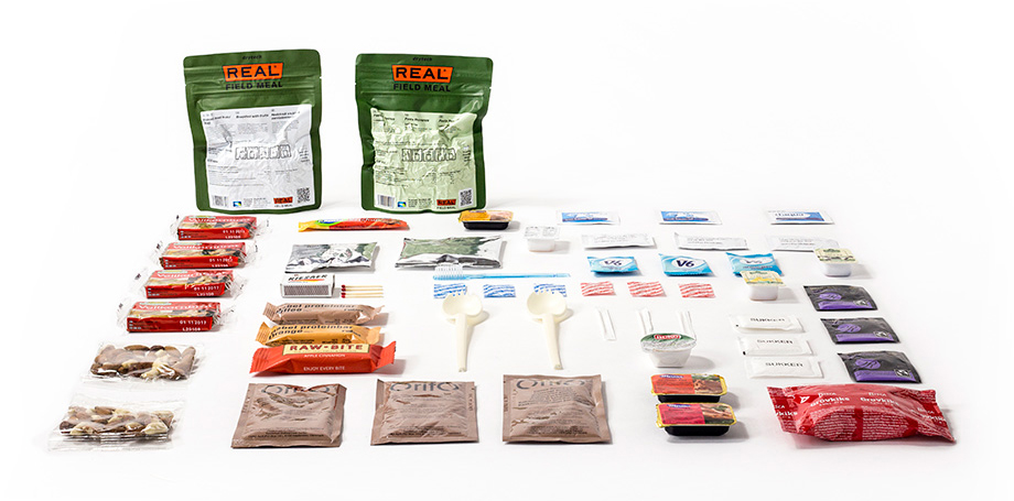 Denmark – Some very contemporary graphic styling. Straight out of WholeFoods?!
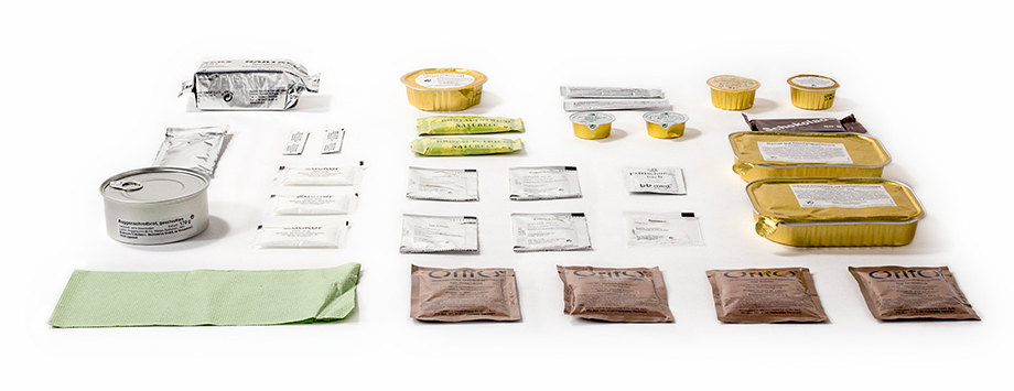 Germany — Deadly efficiency. Right on trend with a warm and cool metal contrasts.
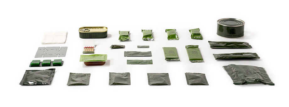
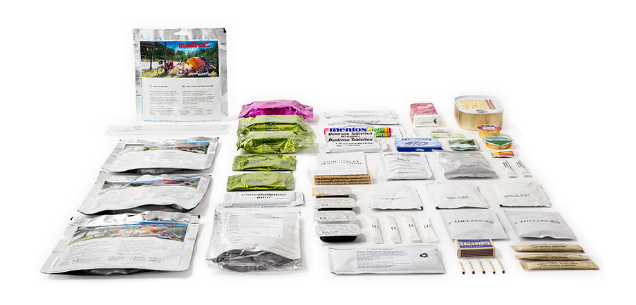 Holland — Friendly, clean, colourful. Unapologetic splash of hot pink foil. Enough grub for 4 men.
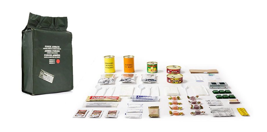 Italy — Modernist. Faultless communication. Nostalgic flourishes.
 New Zealand — Die-hard modernism. Soft multicultural skin-tone palette.
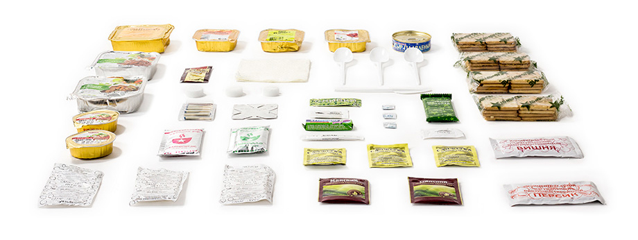 Russia — Wry reference to pet food?
 Spain — Supreme combat colour co-ordination
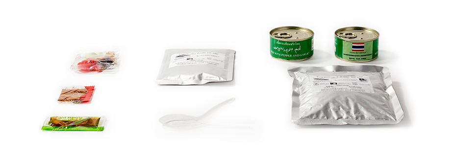 Thailand — ‘Stop eating and get back to work, Soldier!!’
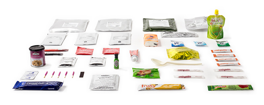 UK — Eccentric. Teabags? Tabasco?!
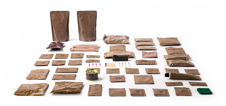
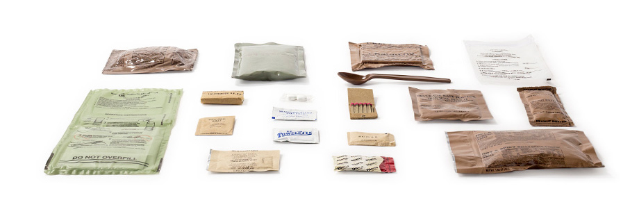 USA — Food. In bags.