For those who appreciate a well-composed plate, it comes as no surprise that we eat with our eyes. For the Copenhagen-based designer Margrethe Odgaard, the adage rings especially true. Born with synaesthesia, a condition where experiencing one sense automatically triggers a secondary sense response, Odgaard tastes colors. Her work primarily focuses on the ways colors and patterns can be functional and inspire interactions with other senses.
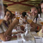
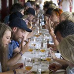
In July, Odgaard collaborated with chef Jakob Mielcke to produce Palate-Palette, an exploration of the four basic tastes our tongues process: salt, sour, bitter and sweet. Through visual representations and a 60-person chocolate tasting, the project was a play of flavor, color and pattern, and how they interact. We spoke with Odgaard about knitting, music festivals and giving into her synaesthesia.
MOLD: What was the collaboration process like between you and Chef Mielcke?
Margrethe Odgaard: I have been collaborating together with chef Jakob Mielcke on various projects, including the interior design and visual identity of his restaurant.
How did you determine colors and shapes corresponding to each taste?
Born with synaesthesia, my senses are connected so I see taste and hear colors. So when Roskilde Festival, one of the largest music festivals in Europe, called me and invited me to do an event at this year’s festival in July, I wanted to take the opportunity to take a closer look at this connection between the senses.
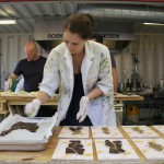
We only had a few weeks to develop the project, so we knew we wanted to have fun and set out to push boundaries by exploring the concept of eating with your eyes. We chose to work with chocolate, but it could have been anything else.
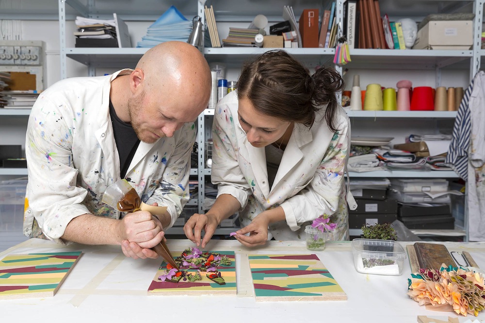
As a starting point and a common reference for us, I knitted four tongues as visualizations of salty, sour, bitter and sweet. These tongues were then used as inspiration for Jakob in determining the taste of the chocolates.
Determining the colors and shapes was all about giving in to my synaesthesia. I used a mindmap of words, associations, forms and materials for each sense, and developed the visualizations from there.
The patterns for the boards and the textures on the tongues compliment one another—how did you decide on patterns? How did the boards/patterns influence the presentation of the chocolate?
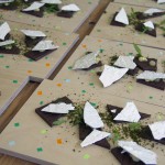
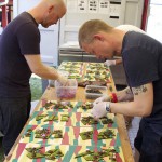
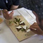
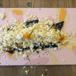
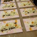
The Roskilde Festival is rather rough around the edges, and we knew that the plating and service had to happen quickly and easily. I decided to print wooden boards for serving with colors and patterns matching the visualizations. The patterns on the boards were developed to mach the feeling of the knitted tongues. Jakob used the bold colors on the boards as a reference in arranging the chocolate. When we asked the guests about their experience eating chocolate from the boards, they found it very inspiring and unusual to eat from a patterned instead of a plain surface with the chocolate servings complementing the colors and patterns of the boards.
Even though we only had a little more than two weeks to create the whole project, and the conditions of the kitchen at the Roskilde Festival was not that of a restaurant kitchen, we had fun, and will continue to develop the concept and explore how the interaction of food, color and pattern and can effect each other.
PHOTO GALLERY of the Roskilde Festival Palate-Palette chocolate tasting below.