The fourth annual Food Book Fair outdid itself on fulfilling our appetite for beautiful cookbook design, food photography and generally gluttonous visual foodie culture. Held at the Wythe Hotel in Williamsburg over three days, this year’s FBF brought up several design-related insights throughout panel discussions, cocktail parties, and the creme-de-la-creme: the Foodiodicals food magazine expo—a showcase of the best independent food zines, including Lucky Peach, Gather, Kinfolk, (the brand new) Brutal Magazine, Cherry Bombe, Runcible Spoon, Diner Journal and more. Here’s what I learned.
1. Call yourself a photographer, not a food photographer.
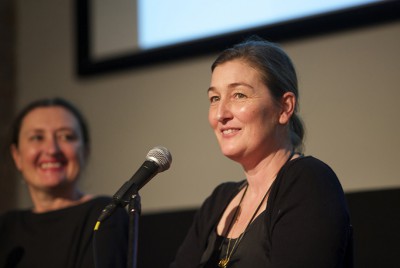
The panel on food in visual media on Saturday brought together a food photographer, a food stylist, and a chef, all of whom discussed multitude of inspiration for their finished dishes. Alison Attenborough mentioned fashion magazines as a primary inspiration for her work with food, and Andrea Gentl of Gentl & Hayes noted that it is important to call yourself a photographer, not just a “food photographer,” so that you don’t miss important opportunities for inspiration from non-food sources.
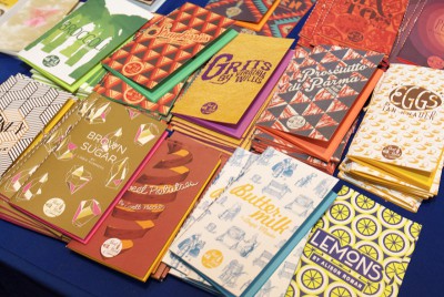 Short Stack small format cookbooks
2. Get specific
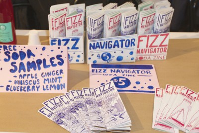
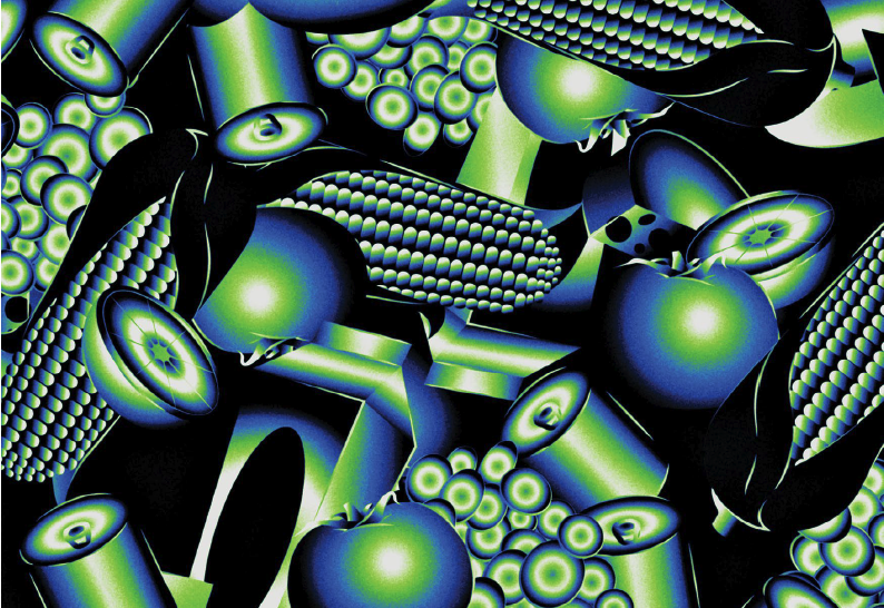
Some of the best and most stunning designs that cropped up in food zines this year were obsessively micro-themed. And that specificity in topic allowed for some beautiful patterns and color palettes. Take Short Stack, for example—their one-ingredient themed mini cookbooks boast clever geometric illustrated covers. Other publications—one of which focused entirely on coffee culture and another entirely on soda—got equally as creative within their niche.
3. Practice self-restraint
When it comes to propping or plating for food shots, less is often more. When asked how she handles dishes that aren’t working, Camille Becerra insists that the answer lies in a stripped-down approach. “I just take it back to something more simple, more basic. Often that solves the problem.” Whether it’s a complex dish or cluttered composition, simplification can lend a hand.
4. Illustrate everything
Food zines and cookbooks were a rather glorious showcase for the revival of hand illustrations. Graze Magazine goes for a monochromatic approach, illustrating the entire issue in a hue of off-green. Runcible Spoon did not disappoint with their elaborate cut-and-paste-style collages, which are filled with line drawings and cartoons. Diner Journal even went as far as to utilize oil paintings for one of their covers, solidifying a return to vintage and passé forms of art as a mark of modernity. [Editor’s Note: See our interview with the illustrator Jessika Tarr]
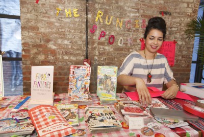 Runcible Spoon displays new issues, including the “Bland Issue” and “Food Fantasies”
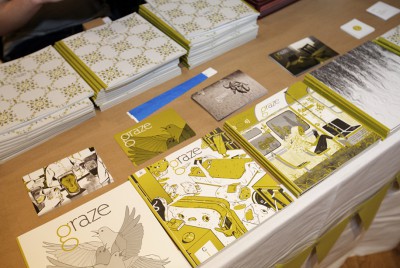 Graze Magazine, which touts itself as a literary magazine that focuses on food
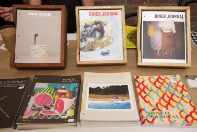 Diner Journal‘s latest issues, including one with an oil painting on the cover.
5. Buy a lot of bowls
Heritage Radio host Michael Turkell of “The Food Seen,” a radio show about the intersection of food, design and art, swears by a massive bowl collection for propping food shots. Especially organically-shaped ceramics, which are perfect for snapping everything from ramen to fresh fruit. They are an immediate way to differentiate your styling from that of restaurant shots.
 Michael Turkell, host of “The Food Seen” podcast, and the moderator for the Food Book Fair’s Visual Media panel discussion
Show us your food design photography by tagging #thisismold on your shots and we’ll regram our favorites!
