A 2014 study from Gallo Wine Trends revealed that 2/3 of wine drinkers buy their bottle according to the label. Wine companies have taken notice and are designing beautiful bottles with shelf appeal. But how do you provide information about grape varietals and vintages while luring distracted consumers? We examine three companies using design to reimagine tradition’s role in wine branding in the twenty-first century.
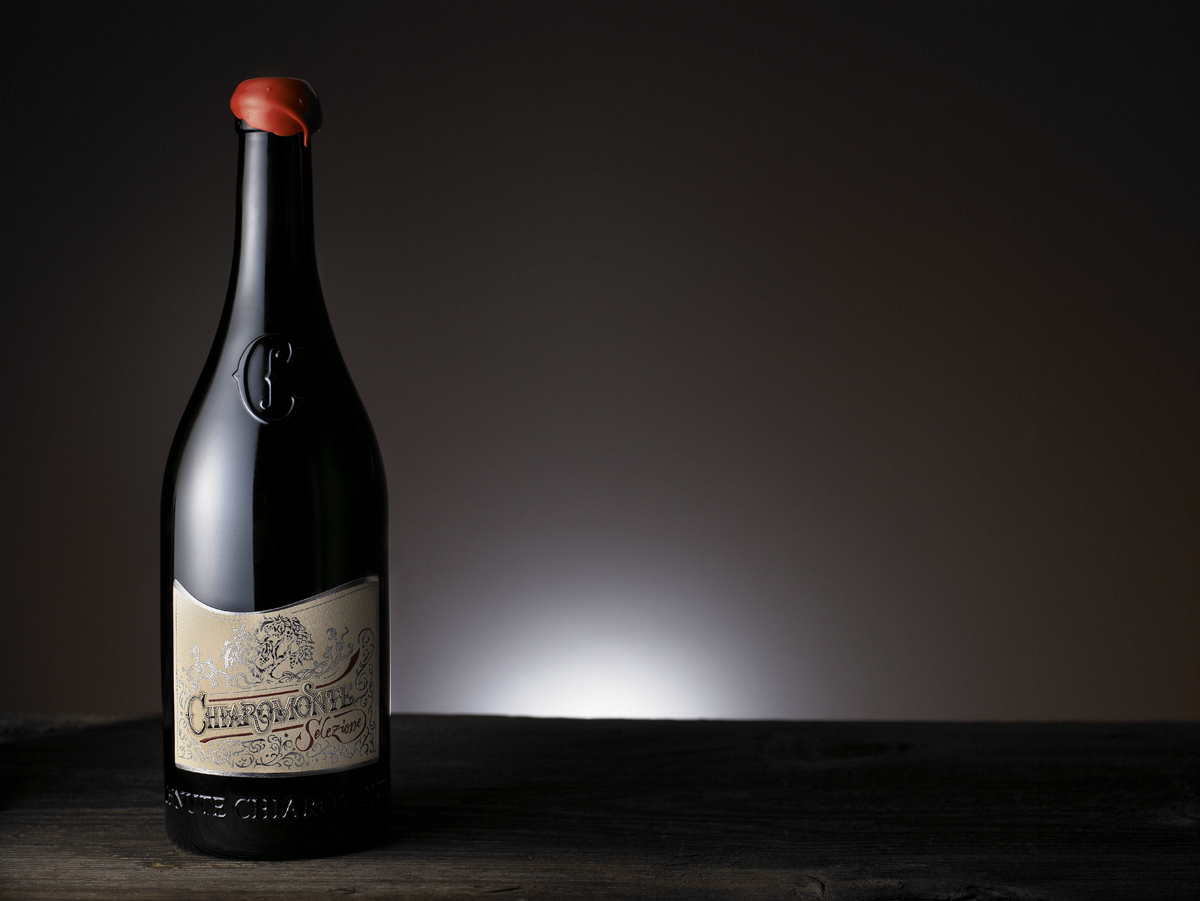 Chiaromonte Tenute Selezione bottle. Image via Package Inspiration.
Tenute Chiaromonte Selezione –The Italian vineyard Chiaromonte recently redesigned the label for their house wine. Before the redesign, the black label sat at the top of a short-necked bottle. Agency Emmidue gave the bottle more fluid lines, turned the label beige and moved it down the bottle. This lower focal point roots the bottle in the new logo, whose detailed lettering and illustration alludes to the past while retaining a sense of tradition. Sitting on the diagonal, the name ‘Chiaromonte’ is drawn in calligraphy-inspired lettering that implies a hand touch. Wax dripping over the cork emphasizes this handmade aura. Information regarding varietals and vintages contributes to building an emotive response. A silver line drawing of the primitivo tree hints at the varietal, while the bottle has raised letters indicating the company and location. Chiaromonte Selezione’s redesigned bottle suggests that wine companies are using wine’s aura of history rather than other properties to attract consumers.
 Dúzsi Tamás Merlot Rosé bottle and branding. Image via The Dieline.
Dúzsi Tamás Merlot Rosé – While the bottle for Tenute Chiaromonte uses traditional imagery to reconcile the past with the present, this rosé from Hungarian vinter Dúzsi Tamás refutes tradition through its design. Although Hungary has a reputation for syrupy sweet Tokaj wines, rose’s comparative novelty allows for a more explicit connection between bottle and brand. Designers Koroknai Kira and Hidvégi Anna say they wanted simple lines and minimal graphics to emphasize the idea of “hand harvesting,” highlighting the wine itself rather than the branding. In this sense, the large pink label that covers majority of the bottle reproduces the wine’s color, signaling unity between the beverage and its branding. The vineyard’s name and the wine varietal appear in a small circle in the center of the label, which emphasizes the wine’s ability to appeal to consumers without shouting its specific properties. Instead, the consumer chooses the elegant, sophisticated feeling evoked by the pale pink hue and sparse polka dots. Whereas wine labels once presented people with metrics to help make their decision, this bottle uses color and minimalism to present a specific idea of what a wine could be.
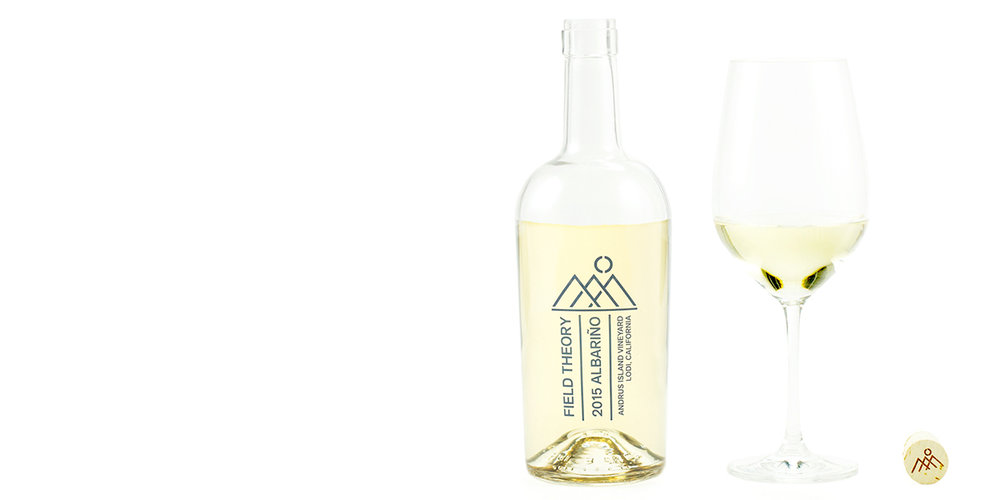 Field Theory wine bottle. Image via The Die Line.
Field Theory Wine – Other companies are reimaging the wine bottle. Based in California, Field Theory’s large, rounded containers reference industrial gin or rum vessels. This new, bolder shape changes the wine’s presence on the shelf, making it stand out to customers who tend to buy liquor instead. Since the bottle is literally branded with information, these customers can shop for wine as they shop for gin or rum. By altering the bottle, Field Theory incorporates wine into a new tradition by broadening wine’s consumer base.
Not all wine aficionados appreciate these new labels. Many professionals and consumers feel these labels needlessly associate the beverage with consumer society. Whether these new wine labels will overturn traditional methods for selling remains dubious. What does seem likely is that wine companies will continue to rethink how wine can boost its shelf appeal to win over skeptical consumers in an increasingly competitive beverage market.