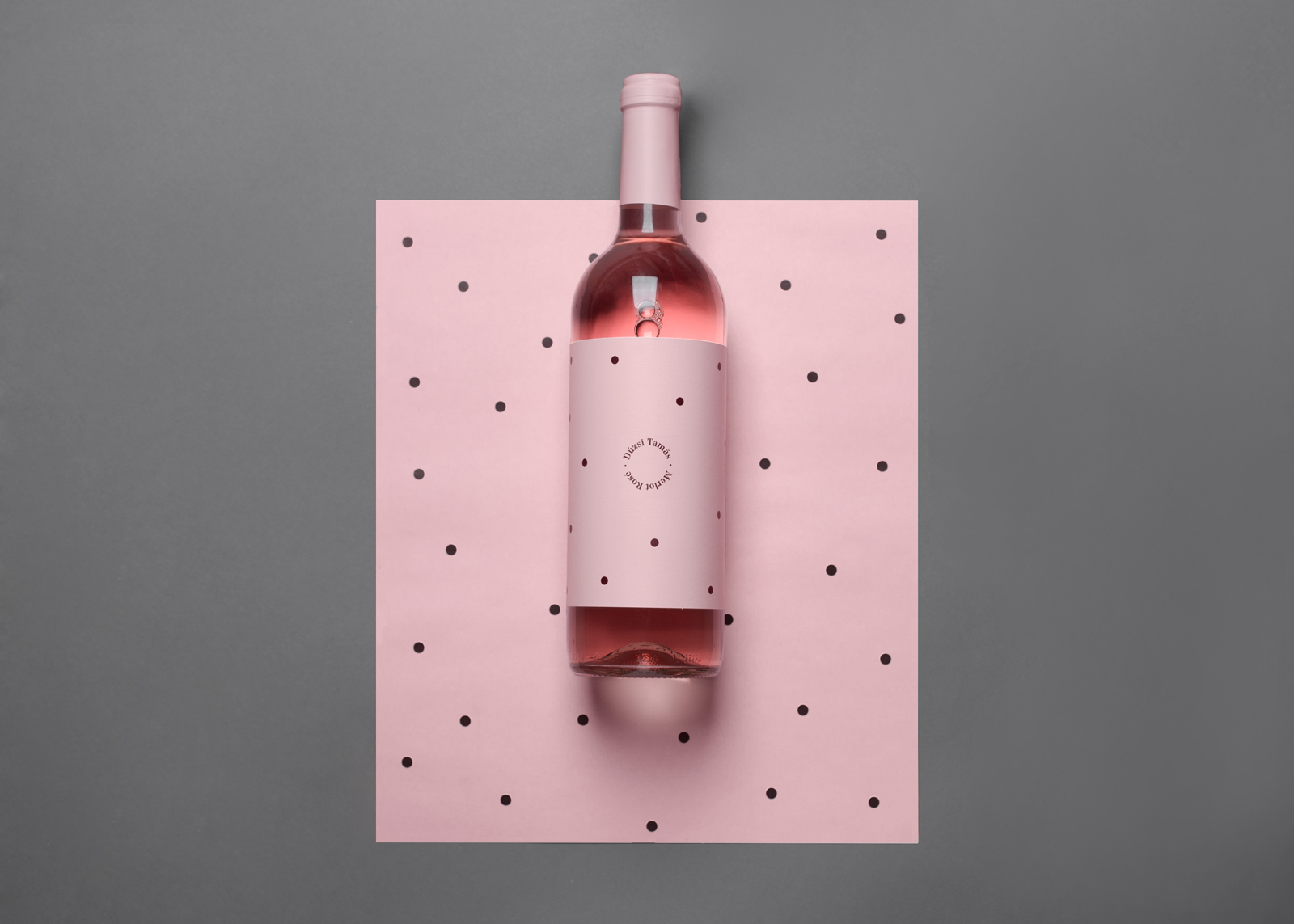
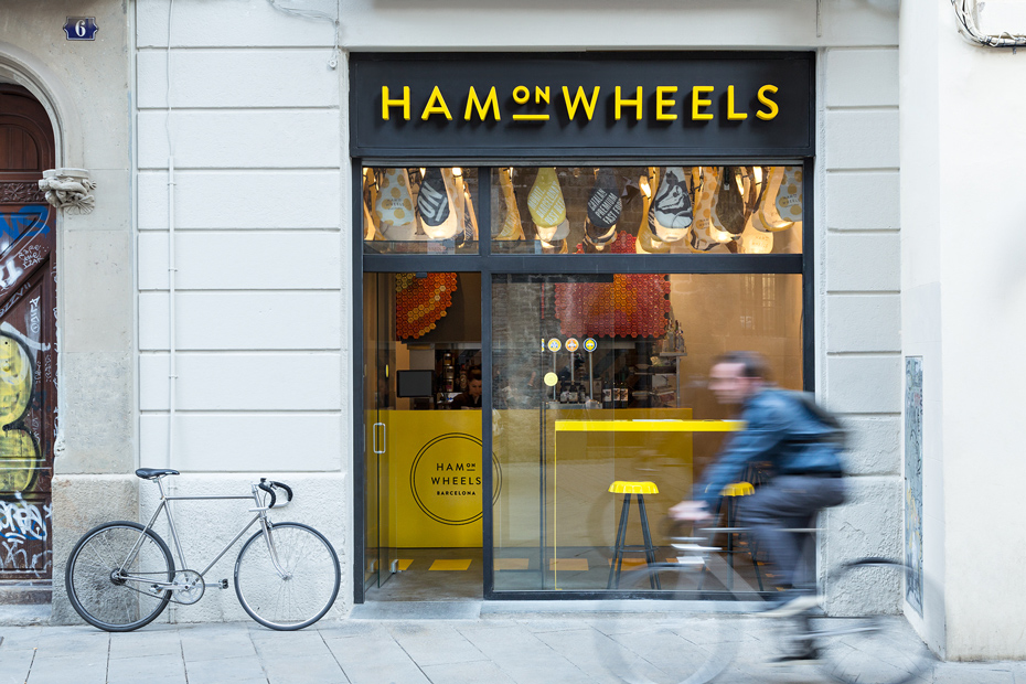
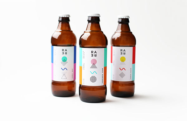
Even when they’re out to eat, designers can’t take a break. A well-trained eye won’t peer away from restaurant signage, table settings, and menu typography, no matter how good that steak smells. So what’s a besieged designer to do? Well, he or she could avoid dining out altogether, or they could channel that energy into creating a comprehensive catalogue of menu design.
Such is the story of Armin Vit, the Austin, TX-based designer who co-founded the graphic design studio and publishing enterprise UnderConsideration after a stint at Pentagram’s New York office. The seasoned designer is also the co-founder of Art of the Menu, a website celebrating the underrated field of menu design. Vit first identified a changing menu landscape after his branding blog, Brand New, fielded an influx of menu and dining submissions. Restaurants were no longer relying on Comic Sans of Papyrus to communicate the flavor of their dishes. Instead, they were using strategic fonts, surfaces, and compositions to communicate their identity–and to keep customers hungry.
We spoke with Armin about what makes a well-crafted menu, its impact on the dining experience, and—we had to ask—his opinion on menus with photographs of food.
MOLD: Considering your formal training and experience as a graphic designer, how do you feel corporate brand design and restaurant menu design differ? What characteristics are important for each?
Armin Vit: To be honest, I think there’s more in common between the two than there are differences. The goal of branding and identity design for both corporations and restaurants is the same: to establish a differentiating and memorable set of visual traits that somehow represent the corporation or restaurant. It’s mostly a matter of tone of voice and context. Corporate design is about establishing seriousness and a trusting relationship, whereas restaurants are about establishing comfort and a sense of place, but the tools to do are mostly the same: logo, fonts, colors, choice of materials, etc.
One thing that’s great about restaurant and menu design in particular is the scale of production. A business might need 5,000 brochures, so that forces you to go into mass production. A restaurant might need 50 menus at most, so that means you can take more peculiar, hands-on approaches to create interesting menus.
How does menu design contribute to a restaurant dining experience? It is simply a branding exercise, or does it actually impact dining and ordering?
It’s what kickstarts the whole experience. You sit down at your table and these things are put in front of you, in your hands. You have to interact with it. If it’s just a laminated piece of paper, then the expectations are one kind–low. But if it’s something where you can feel the materials, or have to leaf through it, or lift flaps, or simply hold it differently than something that just came out of the copier the expectations are higher.
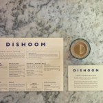
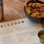
So there’s the decorative, experiential, mood-setting aspect of a menu—the stuff that photographs so well for showcasing on our blog—but then there’s this whole other information-design aspect to it, of proper type hierarchy and readability, that should allow the customer to know exactly what things are, what the ingredients are, and how much they cost. It’s amazing how many menus get this part wrong.
Are there any trends you’ve noticed in newer menus? Anything that stands out to you?
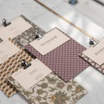
There’s a lot of clipboards! A lot. Which makes sense, since it allows for easy swapping of pages, it sits flat on the table, and it’s very tactile. Despite it being a common trend I’m a sucker for a novel clipboard or a clever way of attaching pages to some kind of board.
Are there any trends that you particularly don’t like?
There’s a trend to use five, seven, or even ten different fonts on a menu. Like, it’s okay to do it on a menu but not on a business card. Sometimes the amount of fonts used gets a little crazy. When done well, this is a great trend in menus, but it’s rare.
Could you spotlight one recent menu that you feel is quite innovative?
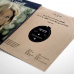
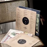
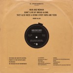
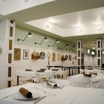
It would have to be the album sleeve menus designed by Apéritif for El Apartamento in Madrid. This goes back to being able to do really short-run production pieces where you can take 12 hours to bang out 20, 30, or 50 menus with an inkjet printer and an X-Acto blade. The name of the restaurant is “The Apartment,” so the choice of an old record is very homey and intimate, and most of us love the nostalgic effect of pulling out an album from the cover, so it’s a very thoughtful idea to turn that gesture into a menu. I love that these are actual records with actual covers and it’s just the sleeve that carries the menu. It’s memorable.
Okay, we’ve got to ask: menus with photos—Anthony Bourdain may hate them, but what’s your take?
As a designer I hate them, too. Almost as a default, any menu we receive that’s photo-based doesn’t make it onto the site. But as a customer with two children, I have to say they’re extremely helpful. I can look at the pictures and get a very quick idea of what to order without having to analyze a menu over two screaming, hungry children. So I definitely approve of their usefulness, but they simply don’t make for good, appetizing design. They leave nothing to the imagination and seem like such an easy way out. Noodles & Company, by the way, has a great wall menu with photos that actually looks great; so it’s possible to make them useful and look good.
Art of the Menu is part of UnderConsideration, a network of blogs, events, books, and competitions about graphic design, which Vit runs with his wife and partner, Bryony Gomez-Palacio. For those in Austin, UnderConsideration is hosting a special event tonight (Wednesday, February 18) with the incredible food packaging and restaurant identity designer, Louise Fili.
