Ham on Wheels, Barcelona’s newest fancy fast-food outlet, is getting some extra buzz from the stellar job local design studio Forma & Co did on its branding and graphics. The yellow-and-black color palette not only feels fresh and slightly upscale compared to the average fast-food joint (think of other brands that have used this color combo to great effect, like Le Pain Quotidien and Au Bon Pain), but the clean and spare san serif type evokes a certain quickness, too–or perhaps we’re simply swayed by the “on wheels” part, a bit of word play that’s further driven home by the bicycle-wheel shape referenced by the double-circle in the logo mark.
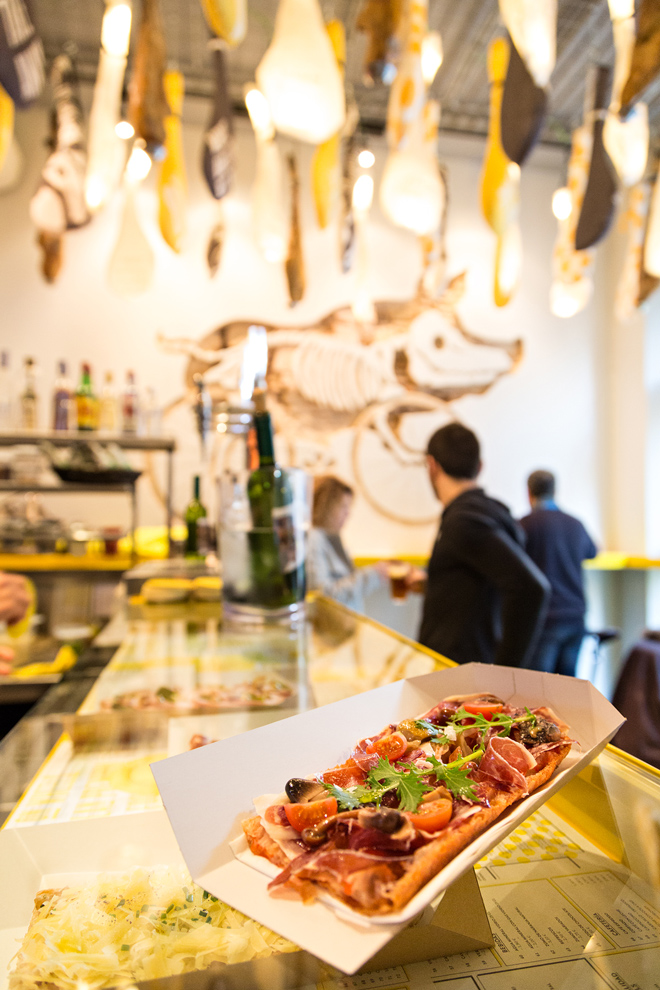
This graphic treatment is also applied to the restaurant’s signage and wayfinding system (see the bike lane painted on the asphalt-like floor) and on whimsical touches throughout, like the bottle cap stool seats, spoke-patterned coasters, and of course, the decorative hanging hams and ham-shaped lighting elements.
As for what’s on the menu, the specialty of the house is a common Catalan street food called cocas, or baked bread topped with a tomato spread and all kinds of ham.
