While flavors like “London Fog” and “Blackberry Brassneck Porter” are making us wish Vancouver’s Rain or Shine ice cream shop was located just a little closer to home, it’s the company’s identity by design studio Glasfurd & Walker that’s making us come back for a second look.
First, can we just say we want to cover everything in their amazing raining ice cream cone pattern? What a brilliant way to incorporate the company’s name into its identity. The rest of the system not only plays with weather puns, but it does so in a way that actually manages to feel fresh and fun without veering into corny or twee territory—no easy feat.
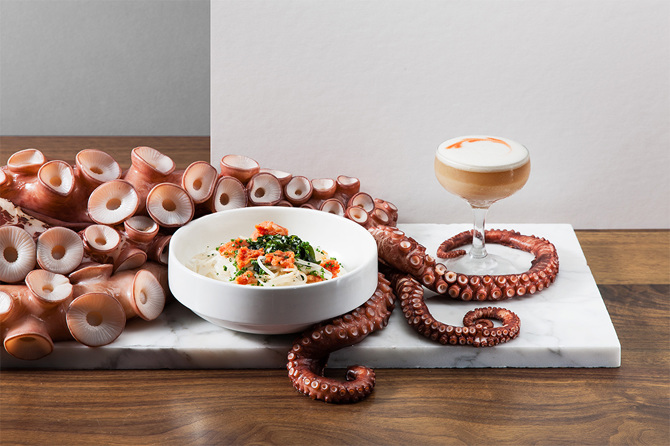
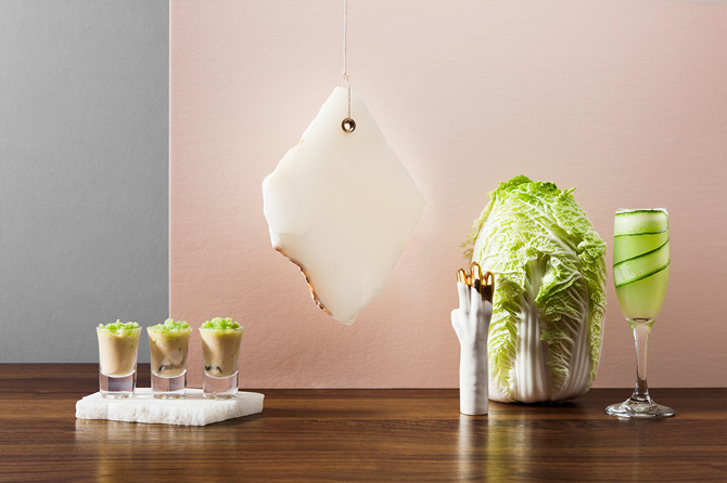
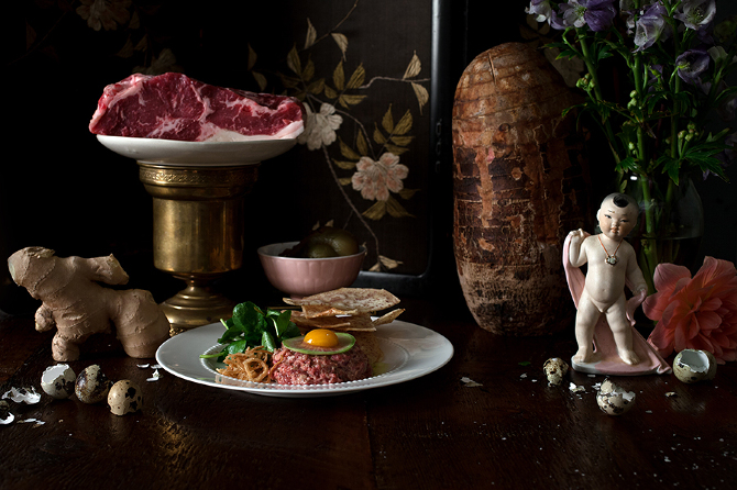
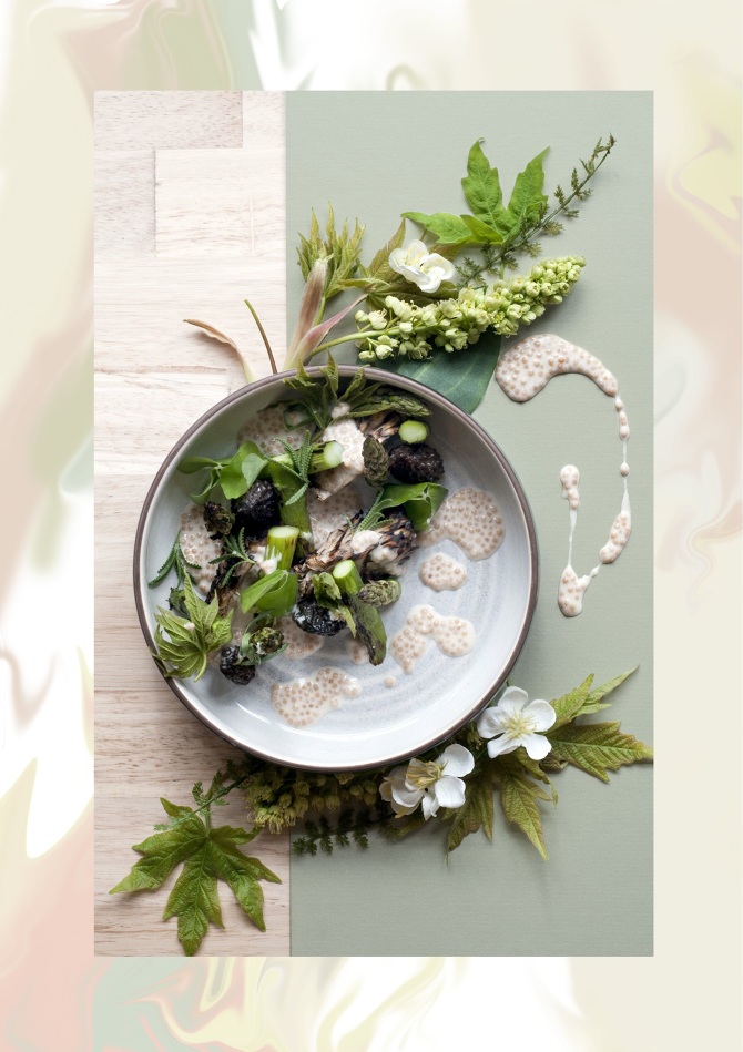
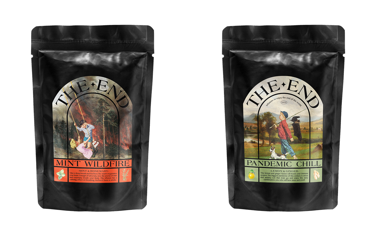
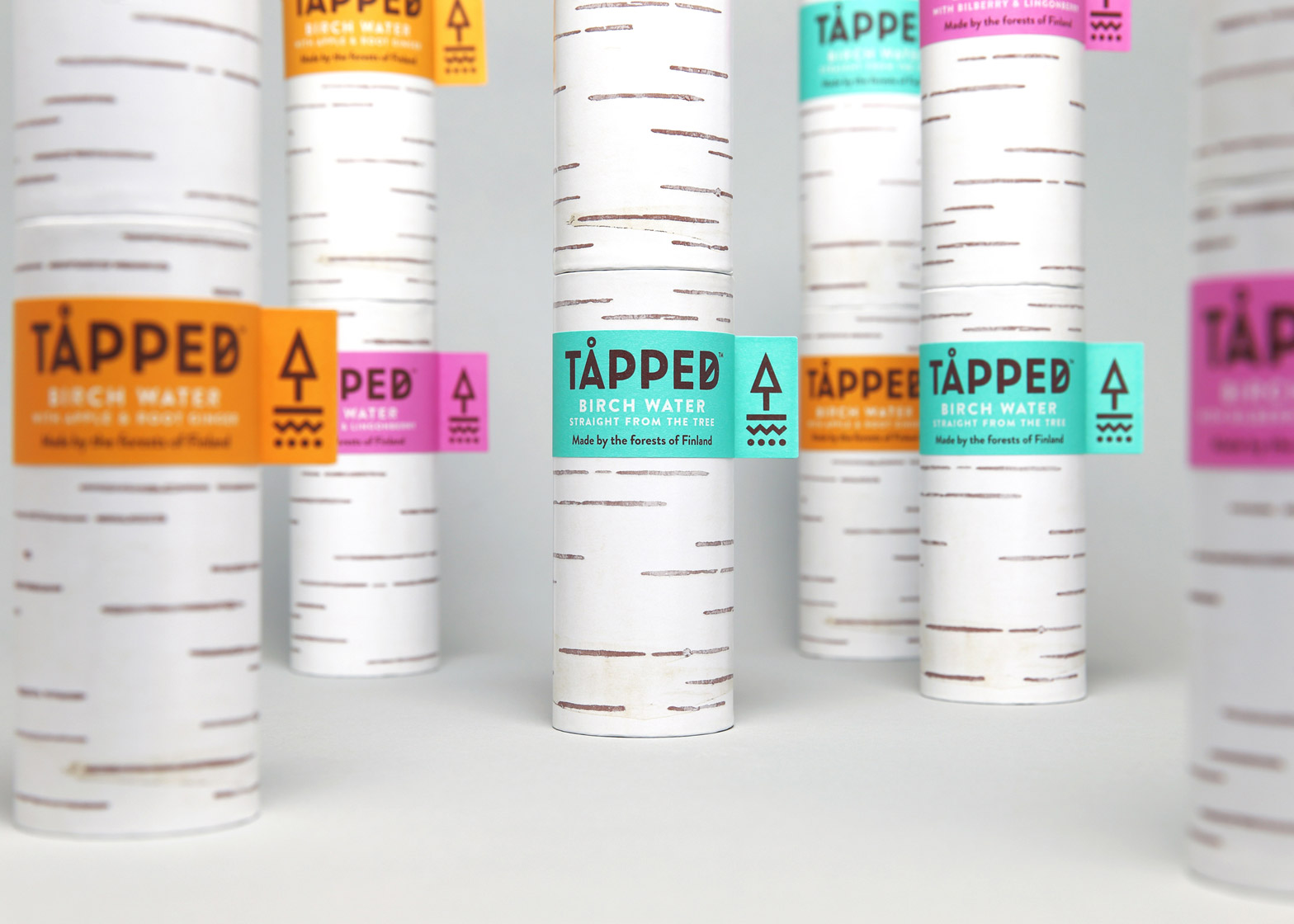
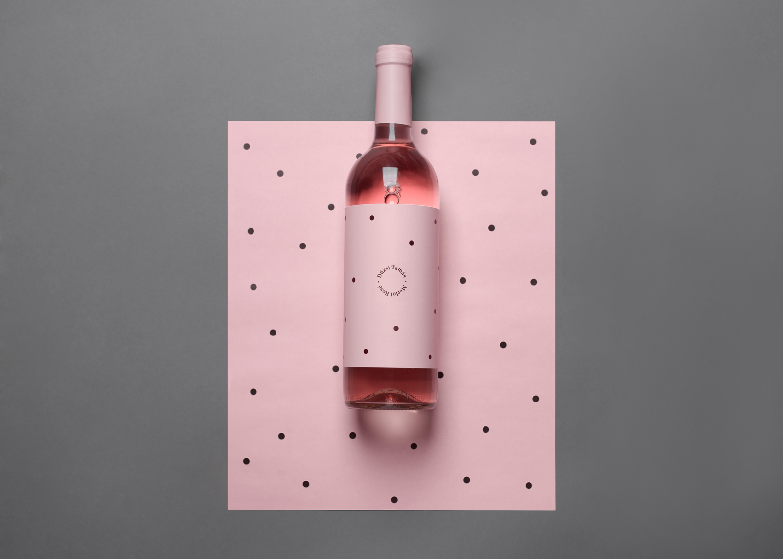
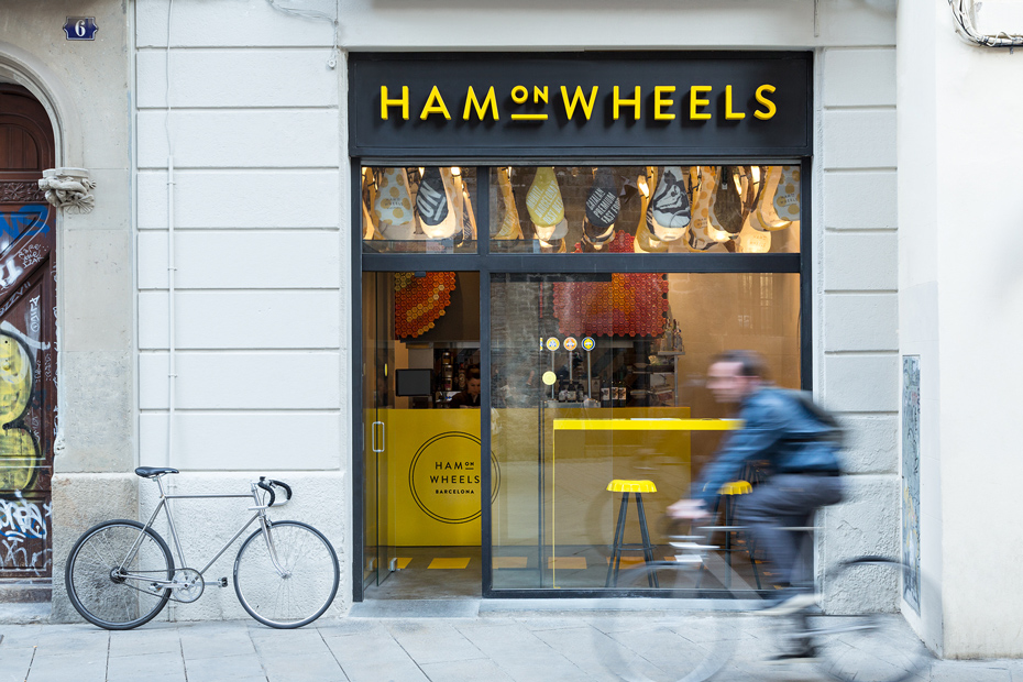
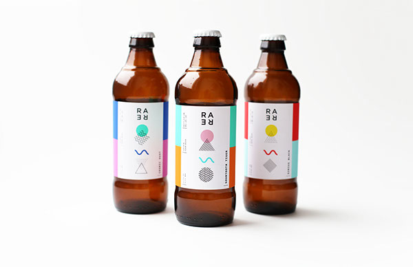
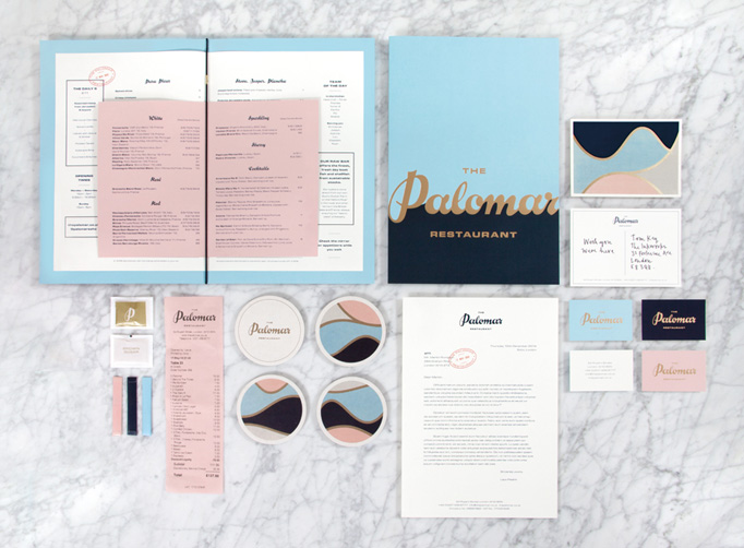
You may have seen previous work by Glasfurd & Walker in the pages of Monocle or Wallpaper* or at the Wallpaper* Handmade exhibition in 2012. They’re no strangers to food product and restaurant design projects. Some of our favorites are below.
