The Visuality of Mutuality is a column about the ways graphic design can help support local restaurants, establish deeper roots for food sovereignty, and nourish local food ecologies.
In March 2020, before the virus had fully descended on the United States, Jennifer Tam and Victoria Lee had already seen the very material impacts of xenophobia and racism on New York City’s Chinatown. Both residents of the neighborhood for nearly a decade, they watched the waning of foot traffic that restaurants and shops depend on, before lockdown measures shut them down completely. That month they founded Welcome to Chinatown, a grassroots initiative to support Chinatown through its small businesses, which they consider “very much a microcosm of the neighborhood, representing everything there is about culture, identity, belonging, and a sense of community [here],” says Tam. When we speak, it’s early February 2021, shortly after a new strain of the virus was found in the United Kingdom, and as Tam points out, was inspiring none of the same discrimination, violence and racist rhetoric towards British people that Asian Americans had been experiencing for over a year.
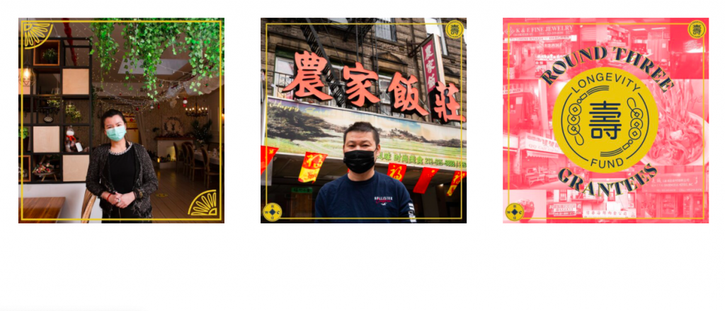
Since March, Welcome to Chinatown has raised $1 million to put towards cash infusions, food donation, census outreach, and merchandise lines for local businesses. One of the things I find so impressive about the organization is the nimbleness with which it can respond to what its community needs; it’s kind of like an unofficial, mutual aid-version of a Chamber of Commerce. A large part of its mission is to “amplify” the voices of Chinatown’s businesses and project a truer image of the neighborhood to those who may think of it only as a destination for trinkets and cheap food. The branding, designed by the organization’s head of creative Harry Trinh, does this beautifully. Drawing inspiration from 20th-century Chinese apothecary packaging that has “an old world, almost Edwardian kind of feel to it,” as well as Chinese religious imagery and Imperial architecture, the visual identity uses a thin, yellow-gold frame embellished with Chinese traditional coins and architectural flourishes to outline the logo, as well as images and Instagram cards.
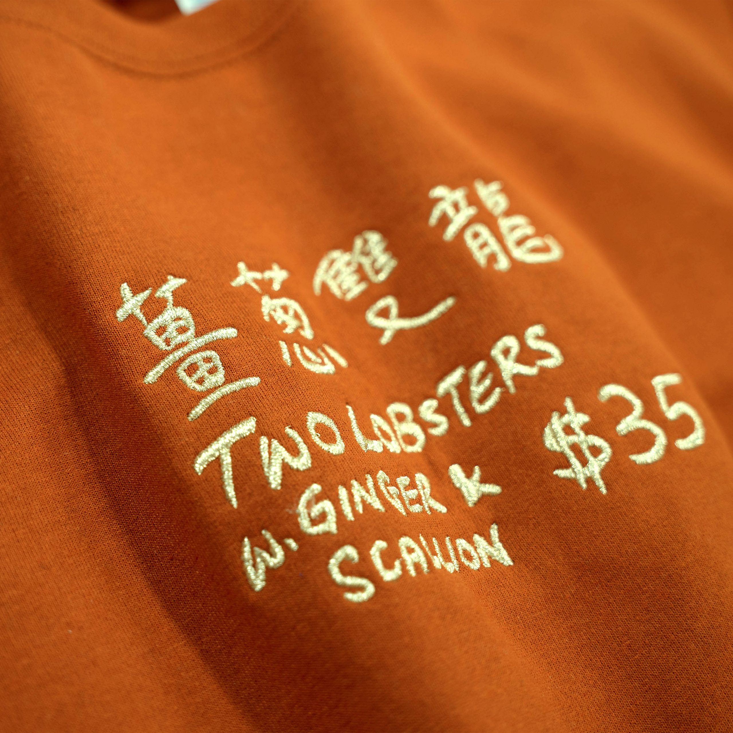
The overall branding also leaves room for Trinh’s team of about eight designer and illustrator volunteers, all of whom are Asian American or of Asian descent, to bring in their own style and perspective to the project. You can see this most notably with its Made in Chinatown program, which partners designers with shops and restaurants to create merchandise that both show off the high quality of Chinatown products and create a new revenue stream under pandemic restrictions. “We saw that a lot of businesses that have more resources, or are linked to larger hospitality groups, were making merchandise to keep people engaged,” says Trinh.
Trinh’s comment alludes to a broader trend for restaurants trying to sustain their businesses over the past year: In lieu of indoor dining, restaurants have been selling everything from food products and pantry items to tote bags, T-shirts, and naturally dyed masks. For the restaurants, products provide a much-needed additional source of revenue, and for loyal customers, they allow for a show of support both monetary and symbolic. As branding categories go, restaurant design tends to be varied and expressive; a visual translation of taste, identity, culture, and personality. It’s fun to see it applied in all these new and unexpected ways, used to signal solidarity and a sense of belonging to a community.
At the same time, there’s a certain amount of branding infrastructure that needs to be in place for this kind of revenue stream to be a real option to a restaurant. You need a compelling visual identity to apply to products, but you also need strong social media channels to promote them, and a webshop to sell them. Trinh notes that around one-third of the restaurants and businesses Welcome to Chinatown works with don’t use social media or have a website, relying instead on foot traffic, cash-transactions, and word of mouth. This is true for many longtime neighborhood establishments, not just in Chinatown. The need to move to e-commerce and online experience has created further disparity within the restaurant industry, between those who have access to design resources and those who don’t.
“As everything was falling apart and brick and mortar was being threatened, I think graphics was the number one need as a lot of restaurants pivoted to doing products,” says Anna Polonsky of design consultancy Polonsky & Friends. Polonsky is the design resource for many of New York City’s (and some elsewhere) independent restaurants; she founded Polonsky & Friends with the intent of working with “mission-driven” restaurants for whom food is a way to foster community and change. I was interested in talking to her about how her services have changed since the pandemic began. She says she’s been designing more packaging and wine labels for clients, taking the opportunity to push more sustainable materials, more digital communication, and more thoughtful storytelling on labels. But strategy-wise, what she’s long advised has just become more true than ever: restaurants need to be able to tell their own narrative very clearly, using their own channels purposefully to speak directly to their community. “A restaurant group may have been doing this, but definitely less so an independent chef, who might not have had taken the time, without an in house marketing team” she says.
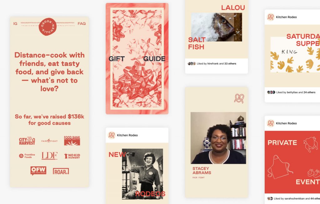
When I speak with Kim Bost, she adds to that sentiment, noting that platform design is another area where designers can be helpful. Bost, who works as a product designer at Netflix, says that she’s also been seeing more chefs communicating directly with their community through websites, social media, newsletters, and platforms like Patreon. “I think that’s something that we will continue to see evolve and see the [design] space build tools around,” she says. At the start of the pandemic, Bost co-founded, along with Betty Liao, Sarah Schenkkan, and Frank Harris the initiative Kitchen Rodeo, which provides a platform for chef-hosted digital cooking classes where the proceeds going to an organization of the host’s choice (or the host’s own restaurant/staff, if they so choose). To date, they’ve put on 61 classes that raised over $158,000 in donations, and over the summer, they partnered with NYC restaurant King to put on a series of courses called Cooking for Equity: Asian Chefs for Black Lives. The money raised went to Stacey Abram’s Fair Fight Action and the promotional design was done, coincidentally, by Harry Trinh.
“Oh, did you talk to Harry?!” asks Bost when we connect over Zoom. When I mention Welcome to Chinatown, Bost points me toward the Instagram posts for Cooking for Equity, which show photos of the chefs against colorful backgrounds, overlaid with Trinh’s digital illustrations of ingredients—ginger, green onion, dumpling sauce—and glimpses of a dragon snaking along the corners. Stamped on the top right are the words Cooking for Equity circling the Kitchen Rodeo logo of a lasso looped in the shape of a soft pretzel. Bost designed the paprika-colored visual identity and logo, along with the playful illustrations of food wearing bandanas on the website, but she says unlike the buttoned-up design processes at the companies she’s worked for, her focus was less on cohesion across assets and more on collaboration with various partners. “It really is about flexibility,” she says, and allowing for design to be expansive enough that the chefs they work with can reach the people in their community.
During a year of social distancing, the act of reaching anyone has more often than not been mediated through technology. While trends like e-commerce and digital communication were in full swing within the restaurant industry pre-pandemic, the crisis has undoubtedly pushed it further. Trinh says the Made in Chinatown merchandise, in which the various merch lines they develop with restaurants are sold on a centralized platform, helps restaurants without an established web presence have some control over their image online. “Up to this point, a lot of the businesses were very rooted in in-person relationships, and if you look them up on the internet and platforms like TripAdvisor, Yelp or Foursquare, you don’t get that same impression as you would going in there,” he says. Many restaurants don’t “own” their Yelp page because of the associated fees, which is just one of many examples of the dilemmas brought about by third-party platforms that restaurants either can’t afford to use or can’t afford to leave (but more on that in a future column).
As restaurants continue to rely on digital communication and to transition their businesses to what works best in the moment, they’ll continue to need the skills and knowledge of designers. As with anything, the “who” is important to consider—who the work is with, who the design is speaking to, and who it (intentionally or unintentionally) leaves out. While we’re communicating over distance, we’re also grounded in place, opening up an opportunity to focus on our immediate surroundings and to find our place in the ecosystem of our neighborhoods. “On its own, [design is] neither good nor bad, but it’s also not neutral,” writes Cortney Cassidy in her excellent essay “Can I Be an Artist Here?” “It all depends on how a designer makes decisions, the intended experience, and who they make it for.”
