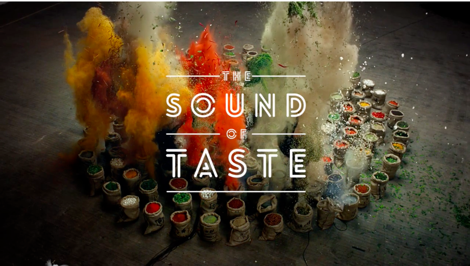
From water sommeliers to coconut water, consumer society has commandeered H2O. So it’s no surprise that companies are working hard to market birch water. This vaguely sweet, lightly syrupy drink is extracted from the trunks of birch trees and traditionally imbibed throughout Northern Europe and Canada.
But it’s going to take more than images of serene Swedes to turn birch water into an industry player. Producers claim that birch water hydrates better than water, tastes superior and boasts plenty of vitamins and minerals. Throw in the fact that it’s lower in calories than coconut water and it would seem like nothing could stop the birch water trend from going global. Yet unlike coconut water, which already commands a premium price, birch water is harder to source. Since it comes from regions where farmers earn higher wages than their coconut farming peers, a small bottle of birch water costs more than a comparably sized bottle of coconut water. Combined with the short window for harvesting the sap (about two to three weeks in early spring) and birch water producers will have to fight to gain and keep customers.
So how are they doing it? We examine three companies that are using graphic and packaging design as their weapon of choice in the “water for health” battle.
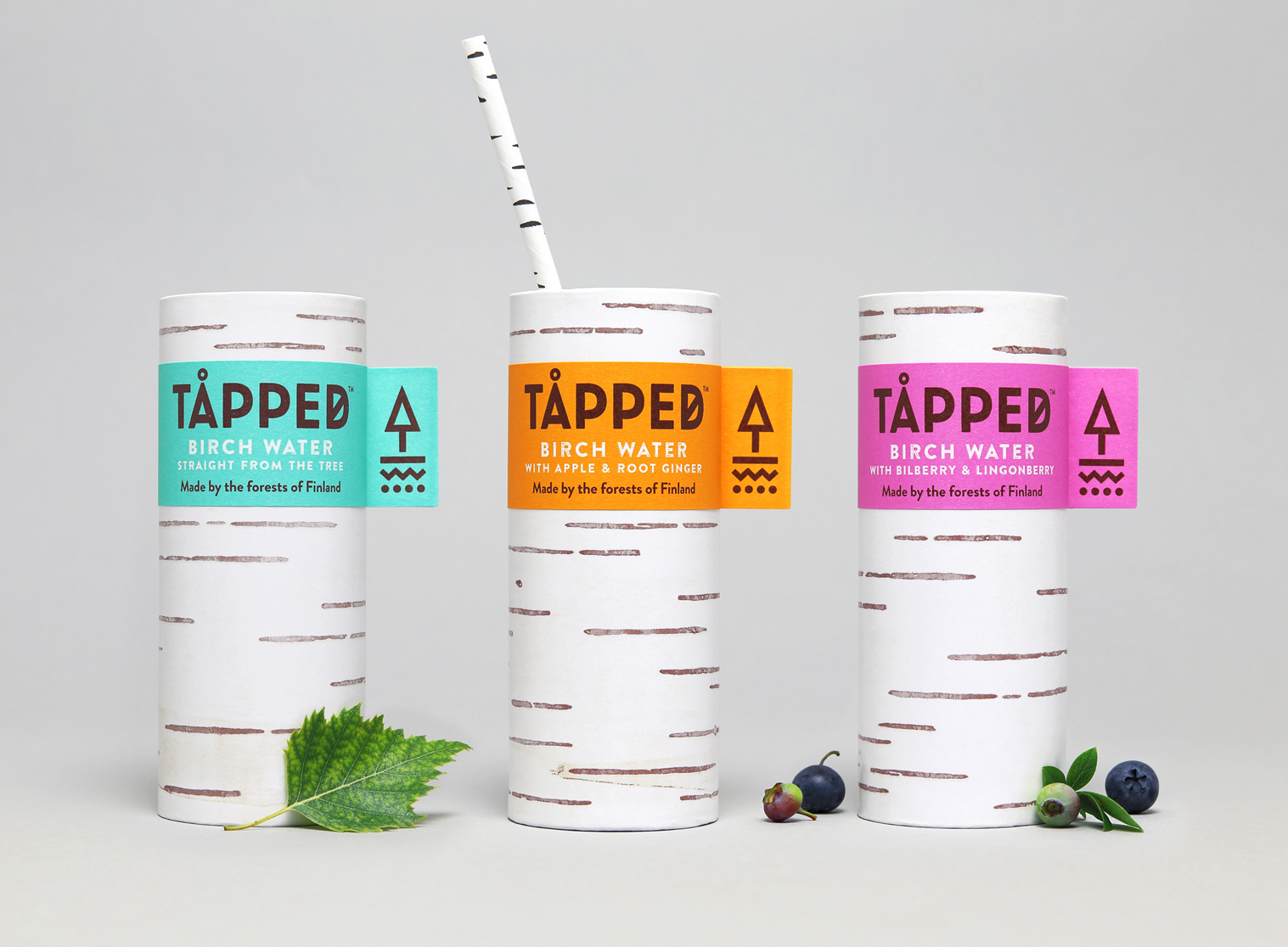
Tapped Birch Water
Tapped Birch Water entices UK customers with a paper bottle designed to resemble a mini tree—and a novel drinking experience to go along with it. This strange bottle emphasizes the product’s newness, which is reinforced through special letters in the logo. Tapped is spelled with an ‘å’ and ‘d’ that resembles ‘ø’. Although this may seem like a graphic gimmick, it also piggybacks on Nordic mania. But this isn’t just a random link. Despite being a British company, Tapped water proudly sources their water from Finland. And since Finns identify with their appreciation for nature, selling birch water as a novel Finnish product serves to expand the consumer’s knowledge of the country beyond Moomin and Angry Birds. In this light, Tapped Birch Water uses novel symbols and design to update their national tradition for a foreign audience.
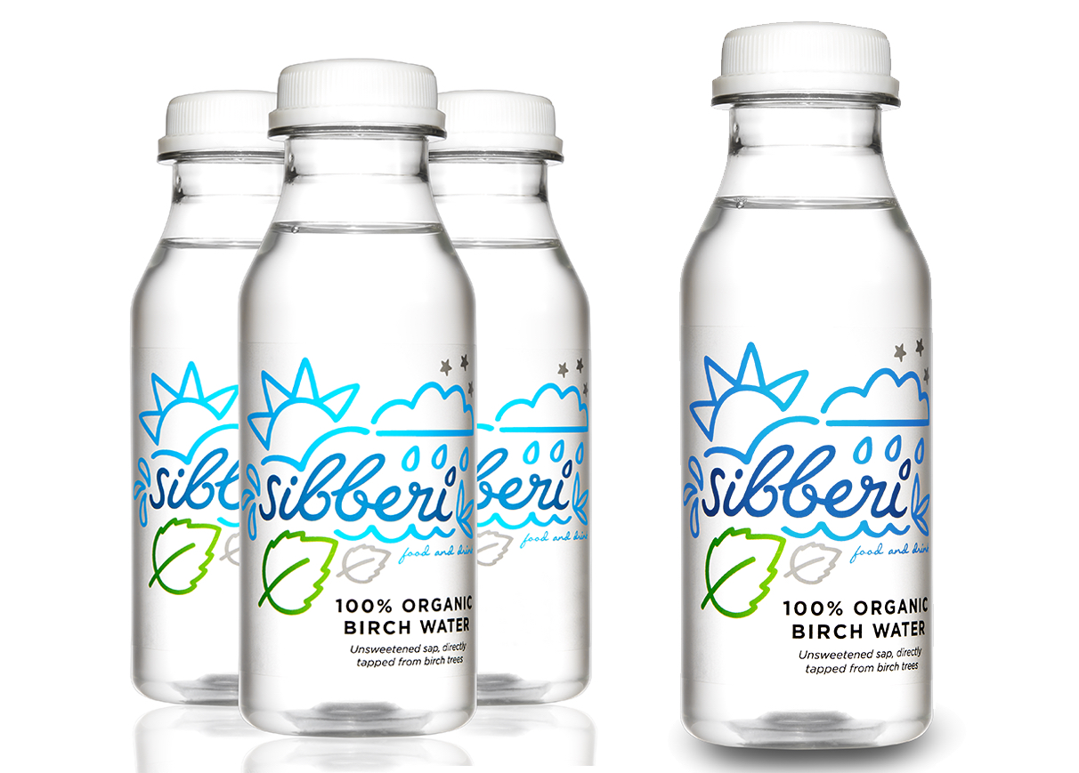
Sibberi
For Sibberi, fun precedes nature and nation. Their small plastic bottles feature bold, graphic illustrations that seem ripped from a comic book. But Sibberi doesn’t just sell birch water, they offer maple and bamboo varieties too. This emphasis on the alternative waters, on performing common acts in nontraditional ways, highlights the idea of fun. Sibberi’s birch water isn’t about getting healthy but about recapturing a feeling of childhood excitement around a product typically seen as boring and routine.
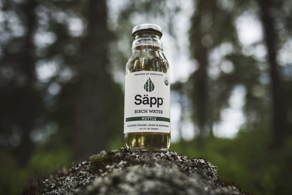
Säpp Birch Water
Säpp birch water does nothing of the sort. Instead, the company uses a glass bottle that uses the friendly shape of iced coffee or Snapple container to highlight the parallel between their product and ones the customer may already drink. With their familiar bottle, the consumer doesn’t have to try hard to picture themselves drinking from the bottle. The slogan “inspired by simplicity” guides the design. Aside from the indicator “birch water” below the product’s name, the only other depiction of the water’s origin comes from an illustration of a small droplet with bold, graphic trees inside. While this logo could evoke birch trees for the consumer, the connection to the plant remains secondary. Instead, Säpp presents birch water as a familiar product that revitalizes the consumer’s daily routine.
From nature to simplicity to entertainment, the companies promoting birch water use their packages to illustrate the life that their product enables. If birch water is to move from a healthy trend to a staple beverage, these companies will need to make their novel product seem natural—and not just in appearance.