Given the abundance, convenience and heavy marketing of junk foods, it makes sense that Americans overconsume solid fats and added sugars, and have diets low in micronutrients. In his book, The End of Overeating: Taking Control of the Insatiable American Appetite, former FDA Commissioner Dr. David Kessler says that many of the foods created by large food companies today are designed to be “irresistible,” to provide ideal sensory pleasure through visual appeal, aroma, taste and flavor, texture and mouth feel to entice consumers to keep coming back for more.
It’s no surprise then that most children, if offered a chocolate chip cookie or a plate of raw broccoli, would probably choose the cookie.
There’s no reason, though, that similar design strategies and techniques used to make junk food irresistible can’t be used to make fruit and vegetable snacks irresistible, too. Food design, after all, is about more than the food—it’s also about creating an experience around the food that’s just as delicious as the food itself. And those experiences can impact behaviors—in this case, fostering better eating habits in kids.
Food companies and big brands—as well as moms and dads—can employ four important experience techniques to make fruits and veggies more desirable to kids.
Focus on ritual
In the design field, it’s well known that engaging the consumer in a ritual can enhance a product experience. When it comes to snacks, consumers complete a series of calculated actions before, during, or after consumption of the food. As children in the 1990s, many of our favorite, not necessarily healthy, snacks involved us in a ritual. There was something wonderful about spreading “cheese” on crackers with a stick to make your own sandwiches. Likewise, there was something satisfying about cutting out the perforated shapes in “fruit” leather before eating them. Part of the appeal and pleasure of these snacks was the designed engagement in the process of eating them.
The same strategy can be applied to fruit and vegetable snacks. The designer/chef (chesigner) can add indulgence through ritual rather than adding more sugar, salt, and fat. But it cannot be just any ritual—it should be a curated experience full of rich and enjoyable associations and cues that strike chords in the consumer’s subconscious. By designing a healthy food to involve the consumer in a ritual, the food item can become more meaningful and enjoyable through the out-of-box experience. When considering how to design the ritual as part of the snacking experience, it should be a curated experience chockfull of rich and enjoyable associations and cues that strike chords in the consumer’s subconscious.
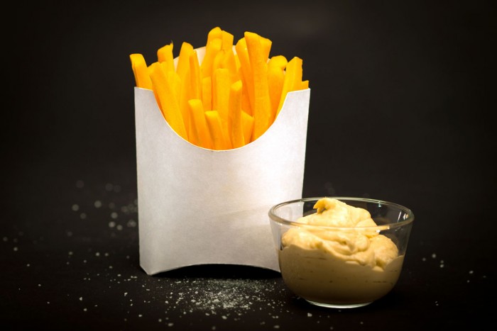
A simple example is placing carrot sticks into a classic French-fry carton lined with wax paper. Just like with fries, the subtle crinkling of the package as each carrot is removed and then dipped in a dollop of hummus in repetition adds a touch of delight because the consumer is engaging with the food. If positive associations are formed through this ritual, the consumer may then desire to repeat the entire enjoyable snacking experience.
Show, Don’t Tell
Visual storytelling is powerful. Snacks shouldn’t have to rely solely on their packaging labels to communicate their ingredients and what makes them desirable. Fruits and vegetables span a gorgeous spectrum of colors and textures, providing a diverse palette for designers to create visually appealing products, and make healthy snack ingredients more understandable and desirable. By transforming the ingredients, but still remaining true to the whole food, they become celebrated and special.
Have you ever received a bouquet of fruit cut into flower shapes? The vibrantly colored fruit is transformed into an appealing display without losing the beauty and identity of the fruit itself. Similarly, Japanese parents make use of the colors and textures found in vegetables, fruit, rice, fish, and other whole foods to create bento boxes for their children’s lunches. The food is not processed and transformed beyond recognition but celebrated in a beautiful scene in the box.
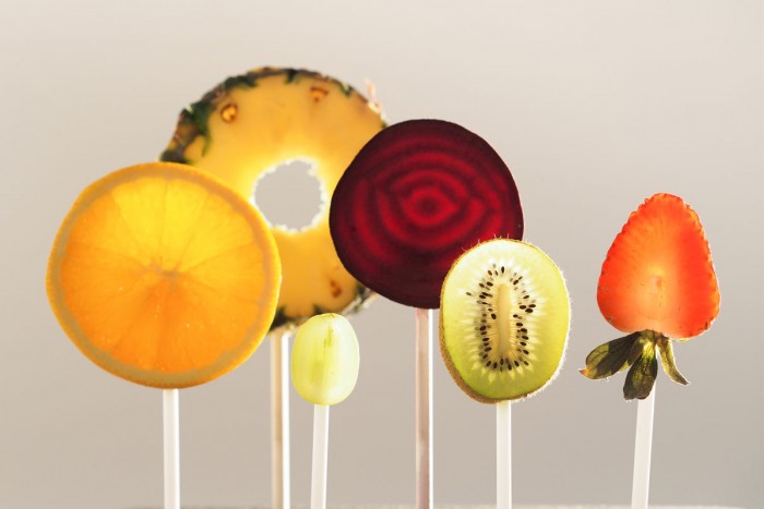
We can also borrow techniques from confectionary design for showcasing and celebrating healthier food. For example, the classic lollipop showcases the colors and shape of the candy through a transparent wrapper and a simple, functional stick that doubles as a pedestal. Presenting fruits and vegetables in a similar manner celebrates their natural beauty and elevates them to a treat status.
Create Purposeful Packaging
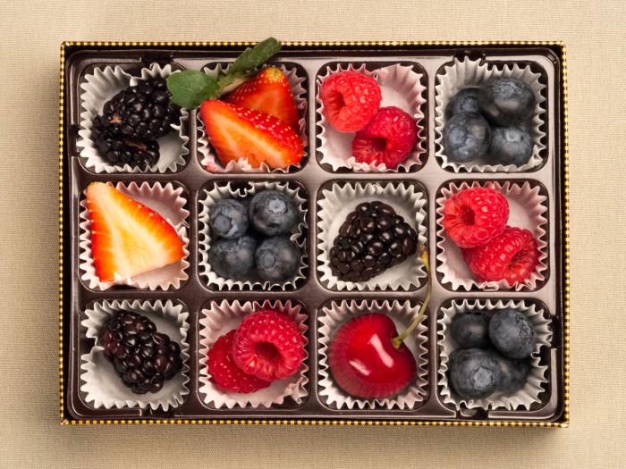
Additionally, the design of the packaging can enhance, or diminish, the visual presentation of the food and the consumer’s ritual experience. An example of using packaging design to create visual appeal and enhance the ritual experience for a food product is the chocolate box. While for some, chocolate may be desirable in any form or presentation, if you were to see chocolates scattered on a table, they would look like a bunch of brown blobs of various shades and shapes. However, when they are placed in individual, textured, shiny wrappers that are then placed in compartments in a beautiful box, they are elevated as a special treat. Additionally, the experience of opening the carefully crafted package creates anticipation that enhances the delight of consuming the chocolates.
The same technique can be applied to a fruit cocktail. If an assortment of berries were placed in the individual compartments of a chocolate box, then they may feel more like a delicacy. This package design also facilitates a slower eating experience where each piece is savored and enjoyed as each piece is enjoyed to its fullest with the ever-important added pause between each bite. It’s not the most efficient way to eat fruit, but it helps us see a healthy snack in a new light.
Avoid Monotony
It has been documented that if a snack contains a variety of contrasting but complementary ingredients, we are likely to consume more of that food. In the case of junk foods, this is a bad thing. However, by combining different healthy foods that Americans don’t get enough of, like fruits and vegetables, into one snack, there is an opportunity to increase their intake.
Additionally, including a small, more calorie-indulgent food in the combination may help capture the attention of an otherwise non-interested consumer. Like a smoker who does not try to quit cold turkey, it can be difficult to go from eating junk food to fruit and vegetable snacks in one day. Including a small amount of milk chocolate with fruit, for example, can help encourage the consumption of the fruit, which they may have never touched otherwise. And, while many classic couples like broccoli and cheese, celery and peanut butter, and carrots and hummus exist, inventing new combinations presents more opportunities to make a variety of fruits and vegetables more appealing.
It is also important to consider the presentation and timing of the more indulgent ingredient. For example, presenting it in a truthful, recognized way can draw the consumer’s attention. Additionally, designing it to be consumed at the tail end of the snacking experience encourages the consumer to eat the fruits or vegetables first. We see this same cadence or rhythm of consumption in regular meals. The dessert follows the entree so as not to spoil one’s palette or appetite. Or perhaps the food indulgence is designed to permeate the entire ritual as in dipping vegetables in ranch dressing.
Anyone from food companies to moms and dads can use the four strategies outlined above to create fruit and vegetable snacks and other healthy foods that kids—and adults—will enjoy.
This article originally appeared on SmartDesign.com under, “How Design Can Help Kids Eat Their Broccoli”. It was co-written by Martelle Esposito, MS, MPH, a public policy nutritionist at the National WIC Association and a part-time faculty member at the Milken Institute of Public Health at the George Washington University. All food photography in this article was created by Russell Blanchard and Joey Zeledón of Smart Design.
