As billions of people around the world celebrate the beginning of the Lunar New Year this week, we’re doing our part to enjoy one of our favorite holidays by getting our fill of dumplings and visiting Chow: Making the Chinese American Restaurant, the most recent exhibition of New York’s Museum of Food and Drink (MOFAD).
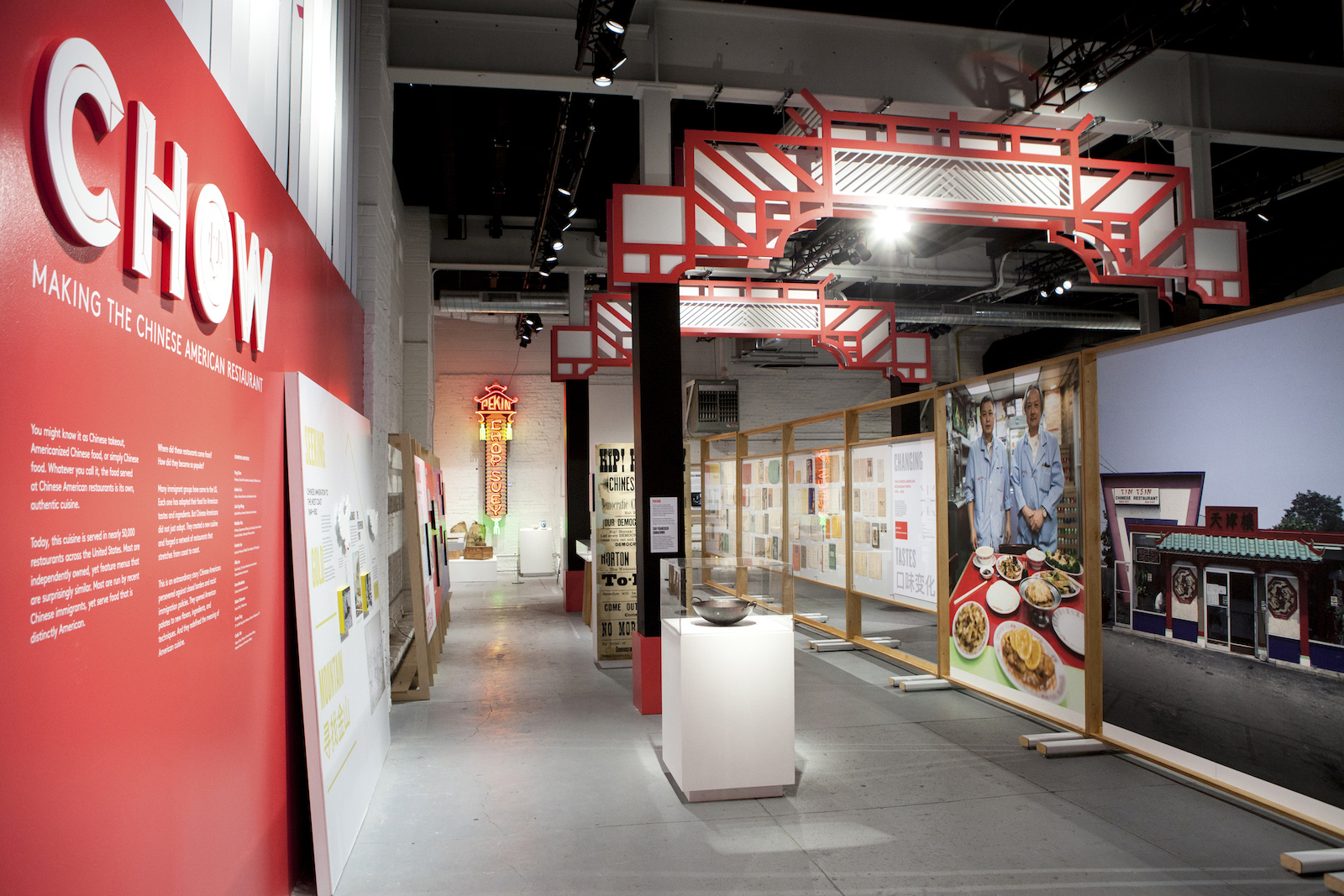
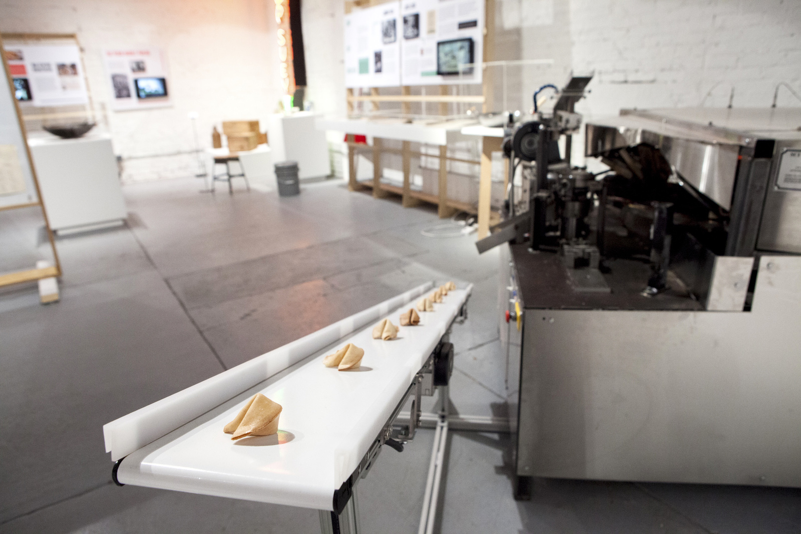
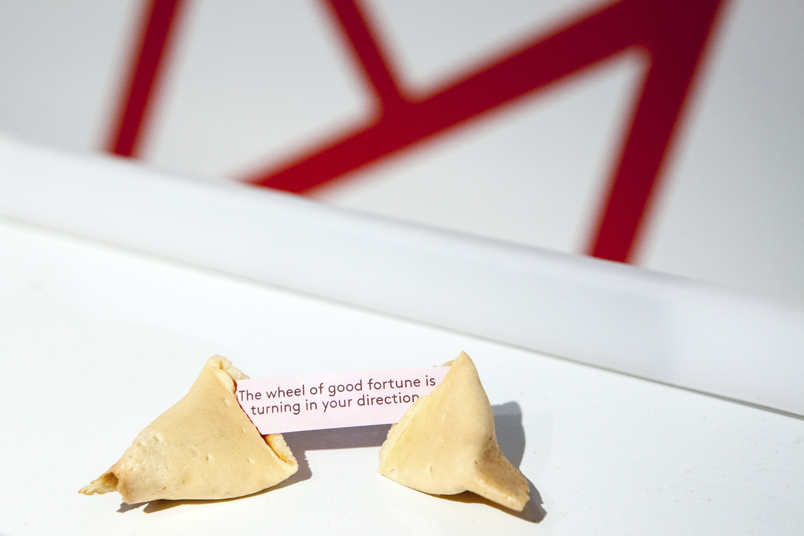
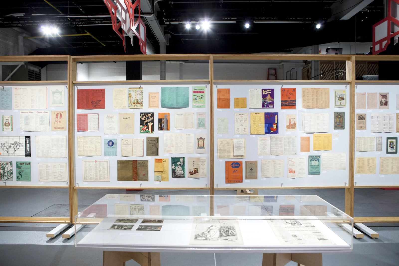
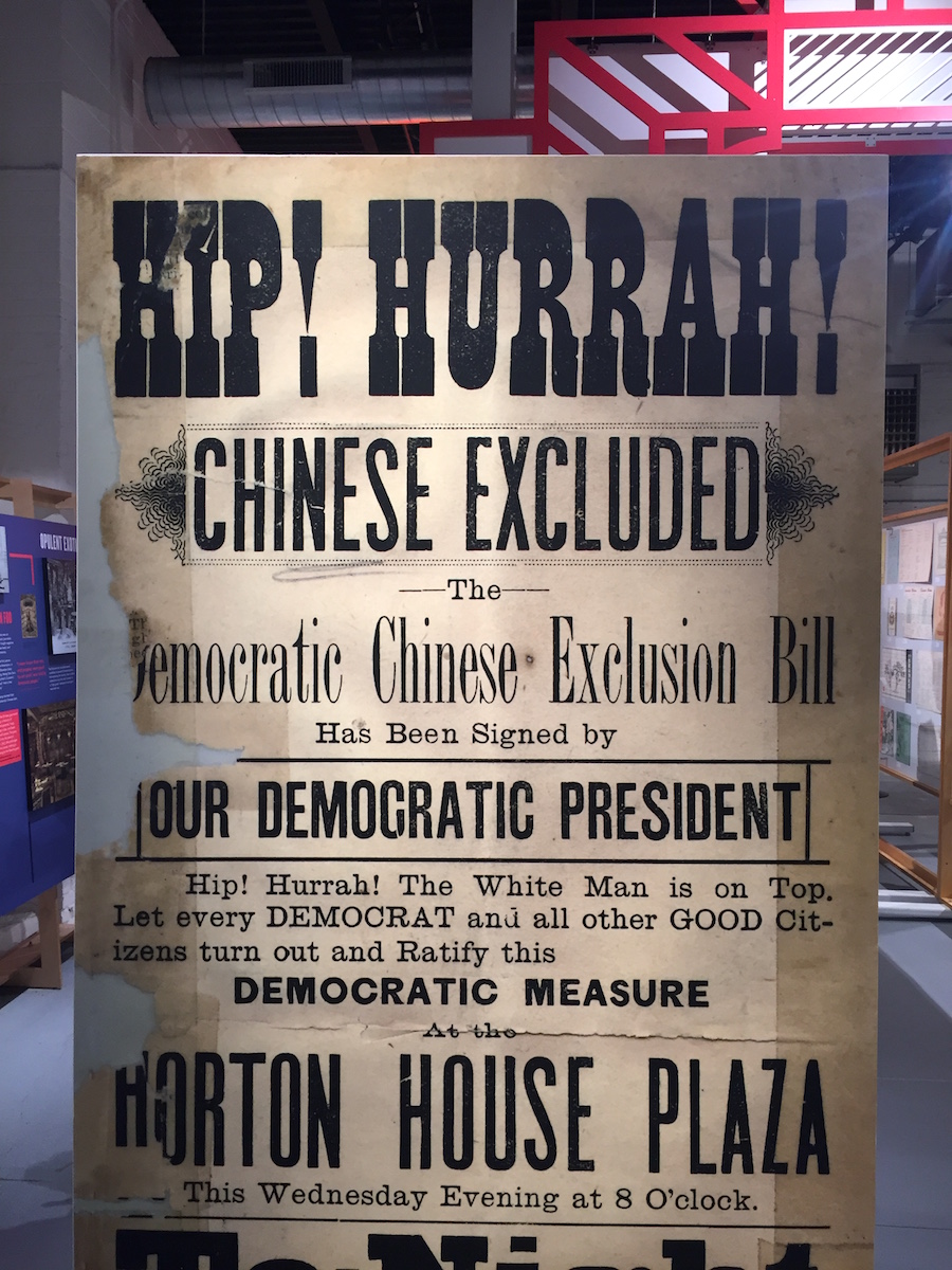
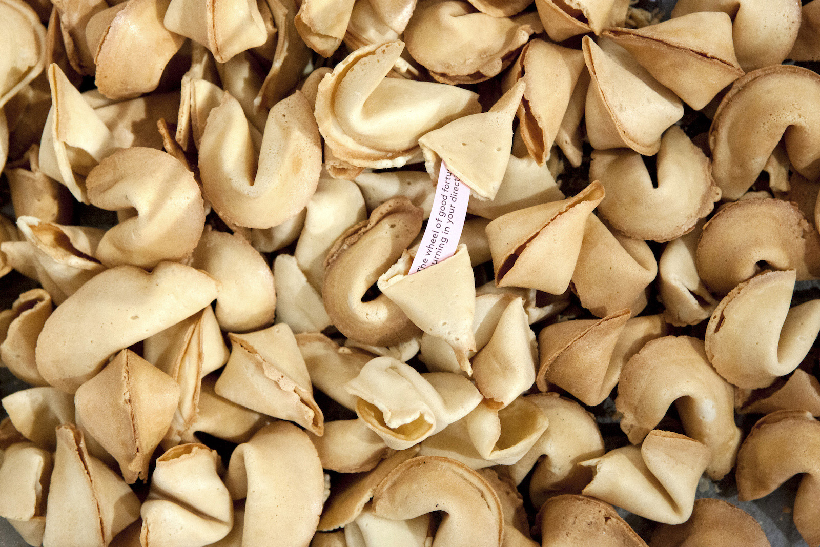
The second exhibition in MOFAD’s temporary home in Brooklyn, Chow is an interactive exploration of the history, artifacts and food culture of one of America’s most beloved cuisines. Starting from the history of Chinese immigration and exclusion in the United States, the exhibition includes a collection of menus from Chinese American restaurants dating back to 1910, rarely seen footage of pioneering restauranteurs and a 1500-pound fortune cookie machine that is printing messages of goodwill submitted from people around the world.
To celebrate the exhibition, MOLD spoke with Ryan Dunn, partner and principle of the creative studio Labour. Their exhibition design and approach to the communication of Chow is an essential element of telling the complex story of Chinese food in the United States. As the creative vision behind MOFAD’s first exhibition on Flavor, their friendly infographics and whimsical animations have helped define the aesthetic experience for the museum. For Chow, the studio worked with MOFAD’s team to divide the exhibition space and guide visitors through a timeline spanning over a century of Chinese food in America.
MOLD: Where did the inspiration for the dramatic takeout box curtain come from? Why was it important to open the exhibition with it?
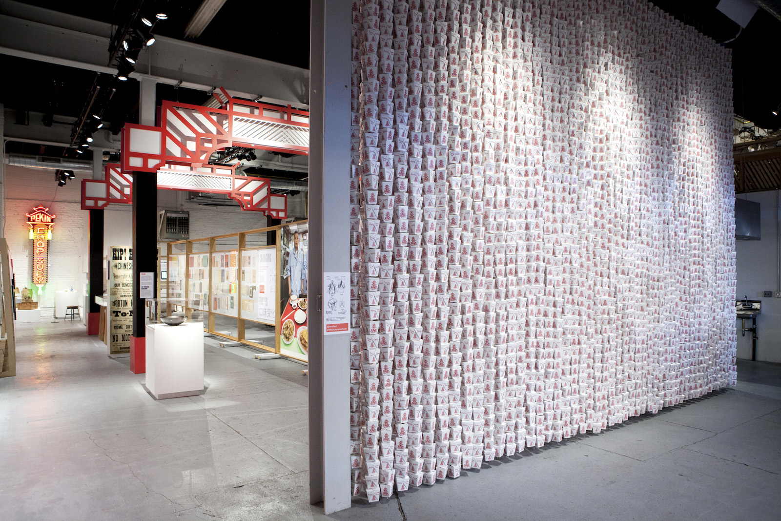
Ryan Dunn: The takeout box curtain serves a number of conceptual and practical purposes. Originally, it came from wanting to create a physical representation of the number of Chinese American restaurants in the United States. The number of restaurants is enormous, something around 40,000. In the curtain, each box represents about seven restaurants.
We chose the takeout box for its obvious association with takeout restaurants, but it was also intended to be a familiar point of entry for visitors. It’s just a humble takeout box, but when presenting several thousand of them twenty feet high, something so simple and so ubiquitous takes on new meaning. From a practical standpoint, the takeout box curtain was a way of dividing the exhibition space from the reception area, while creating a striking visual moment visible from the street and from everywhere within the space. Themes of “obstacles” and “barriers” are explored throughout the exhibit, so we thought it appropriate to begin the exhibit with a monolithic yet permeable barrier.
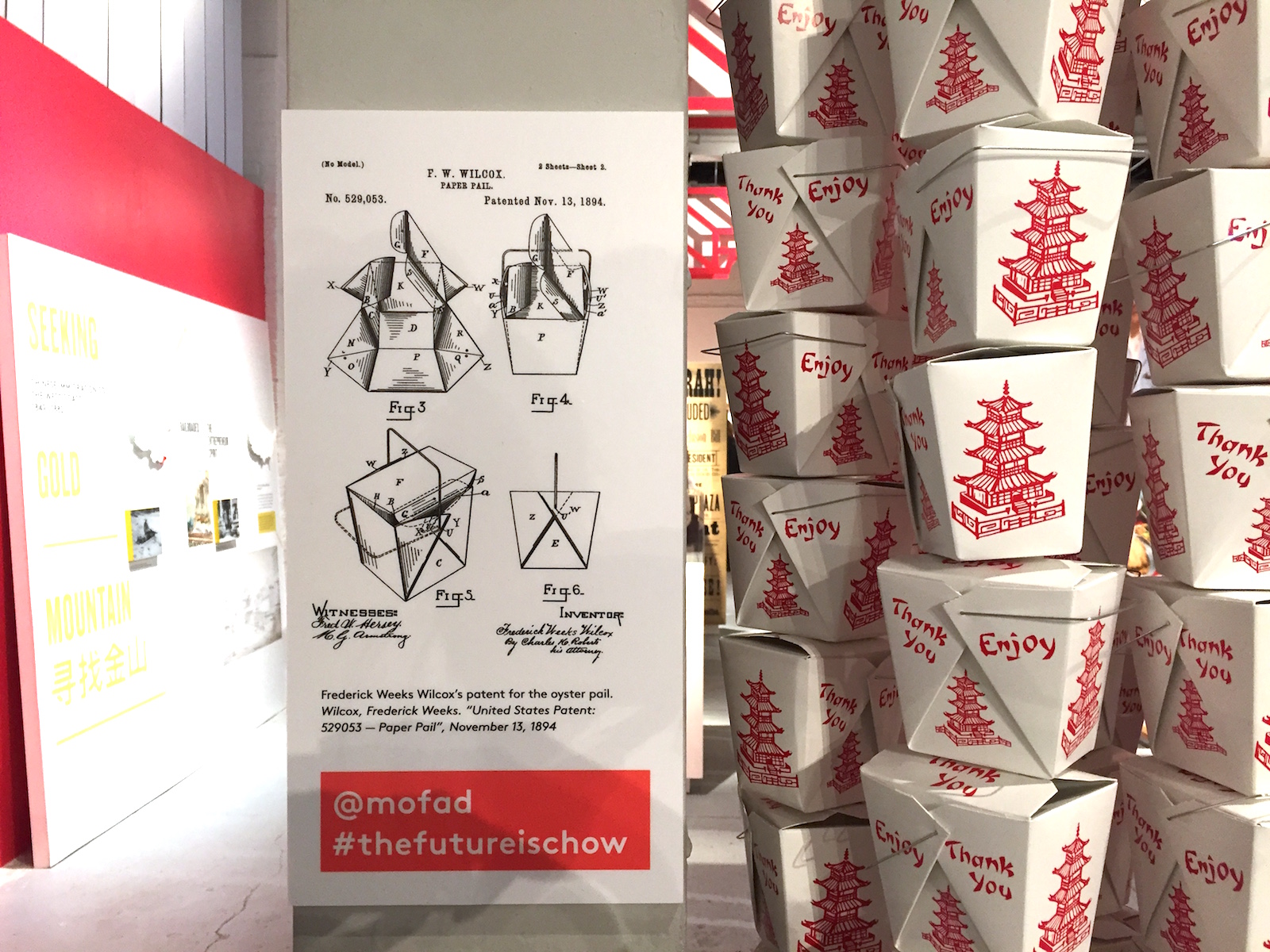 The oyster pail, affectionately known as the Chinese takeout box, was designed by Frederick Weeks Wilcox in 1894.
Your design for the Flavor exhibition helped draw together disparate elements—machines, ephemera, history and science. What was the primary design challenge for this exhibition and how what was your approach for resolving it?
In the Flavor exhibition, we had a choose-your-own-adventure type of layout, where we organized content into story-based zones. We had a desired flow in mind, but really, the visitor could meander through the content any way they wished. Chow is different. The team felt it was important to tell the story in a linear way because in order to communicate how the cuisine developed, you have to lay a foundation of circumstances for why the cuisine developed, and then build on top of that.
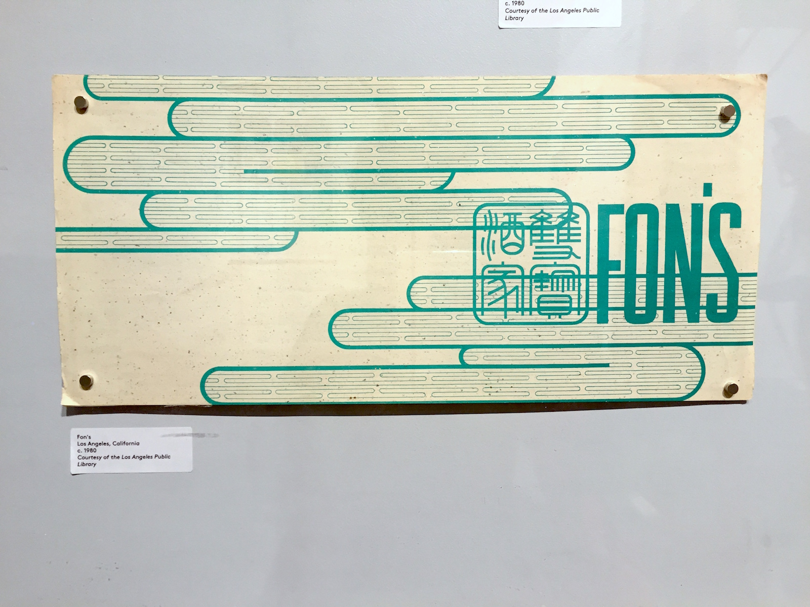
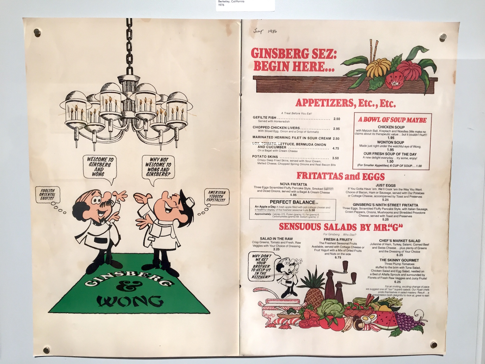
The main exhibition space is a big, open floorplan space. So, in order to create a linear flow, we divided the space in half with a 40 foot long chronological display of Chinese restaurant menus spanning over 100 years. Visitors enter at the beginning of Chinese immigration and end at the present day with the Chow Culinary Studio. In addition to the themes mentioned above (obstacles and barriers) we also worked with ideas of journey and passage. These ideas are expressed largely through the linear exhibit flow and the stylized paifang that span the space, bridging the separate sides created by the menu wall.
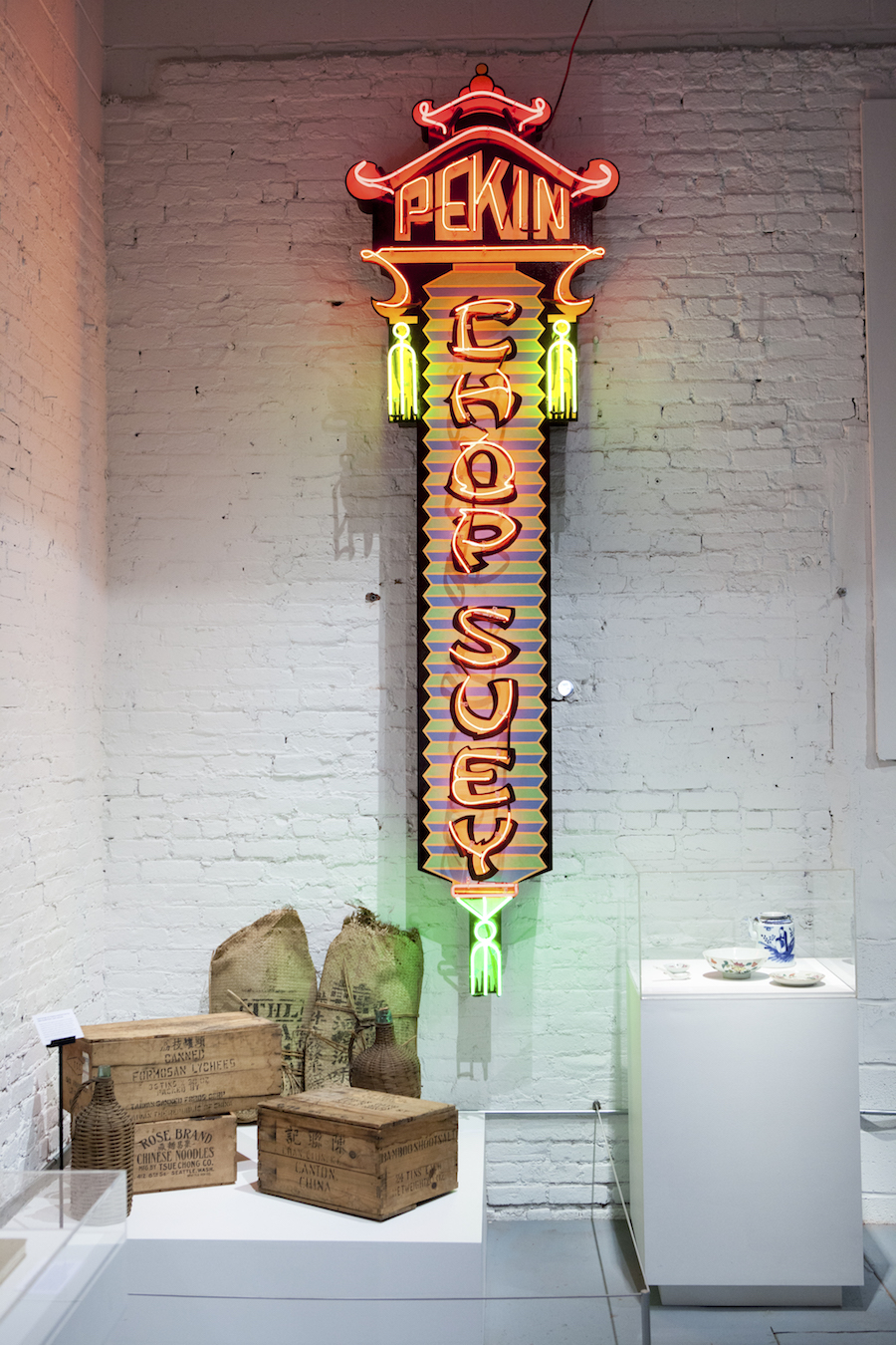
Aesthetically, it was important for us to sensitively draw inspiration from the rich design language associated with the cuisine’s restaurant culture, while not falling into stereotypes and caricature. Our goal was not to create a copy of the design language, but to draw inspiration and move the visual identity of the exhibit into a new space that is uniquely MOFAD. The paifang are a good example of this. We chose to reduce and stylize the form to a point where they act as icons, representing Chinatown gates without being replicas.
What was the most surprising thing you learned about Chinese food in America?
Learning about such a broad number of topics is really one of the most rewarding parts about being a designer. There are really so many things we learned through the process. Definitely one of the most surprising is the sheer number of Chinese American restaurants in the United States, largely independent of each other, yet all remarkably similar. Talking with friends from other parts of the world, Chinese takeout places where they’re from are similar to the ones we have here. The realization I came to was that one of America’s biggest culinary exports to the world is actually Chinese (American) food.
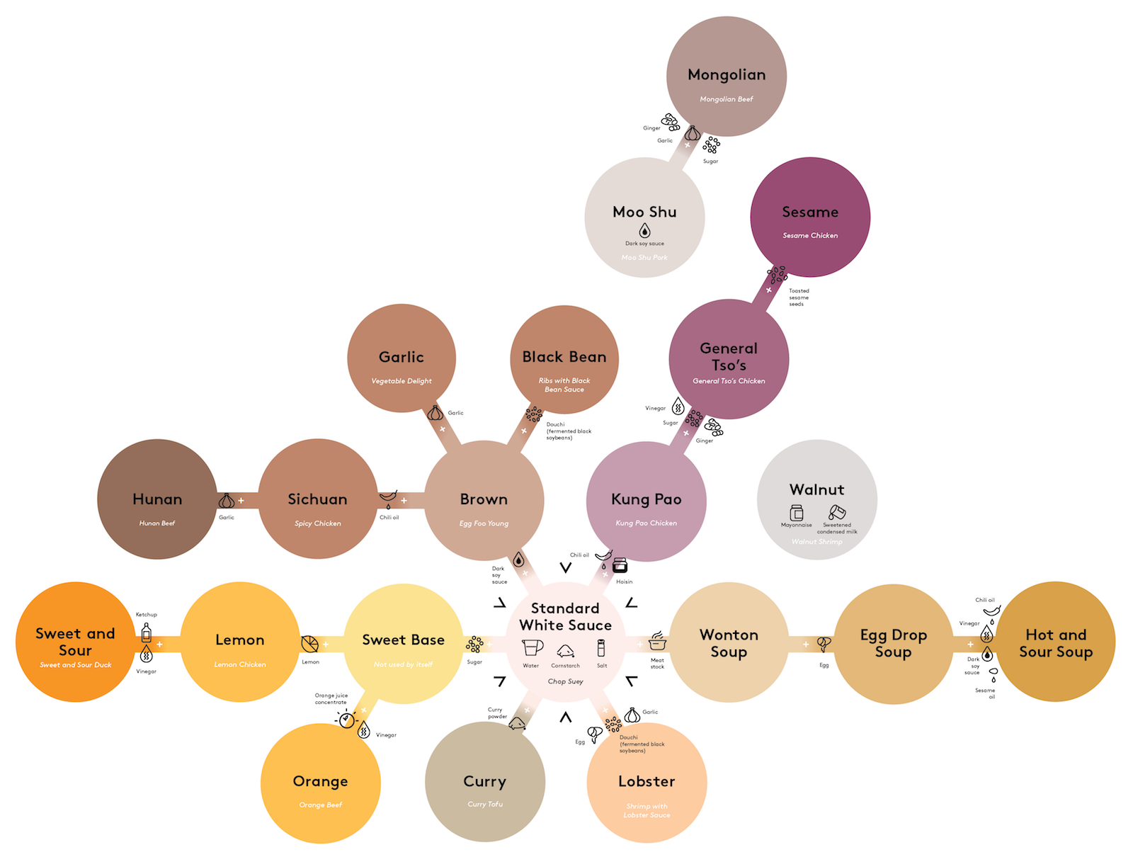
Also a fave is the Sauce Tree, an infographic breaking down how the most common sauces in Chinese American cuisine are created. It’s always been a mystery to me how Chinese takeout can be made so quickly. This map sheds a lot of light on this. This type of diagram didn’t exist, as recipes are typically transferred orally. The museum team got the lowdown from Ron Lee and Winnie Tse from the Golden Wheel and New Wing Hing in Detroit, and we visualized it.
From one base, a cook can make so many different dishes. For instance, take the standard white sauce (water, cornstarch, and salt) add chili oil and hoisin and you get Kung Pao. Take that and add vinegar, sugar and ginger and you get General Tso’s. Take that and sprinkle some sesame seeds on top and you get Sesame Chicken. Other fun things are that the Chinese takeout box was actually invented by a white guy in Chicago in 1894. And fortune cookies are derived from a Japanese pastry. What could be more American?
The exhibition really drives home the fact that culinary exploration is really entwined with politics and history. Why was this important to highlight?
To tell the story of Chinese American cuisine you have to tell the story of Chinese American immigration. This story is so timely and so relevant right now. The amount of racism, exclusion and demonization Chinese immigrants faced sounds a whole lot like current social and political discourse surrounding other immigrant groups today. In addition to gaining a better understanding of a truly American story, it’s my hope that our visitors can see the relevance of this story today and hopefully not repeat the offenses made in the past.
Chinese Americans persevered against closed borders and racist immigration policies. They opened American palates to new flavors, ingredients, and techniques. And they refined the meaning of American cuisine. – Opening Text for Chow, MOFAD
What’s your favorite Chinese takeout dish?
One of my comfort food go-tos is Sesame Chicken. The sweet, tangy, gooey crunch is tough to beat. The place by my house always tosses in two pieces of broccoli. Always two, no more and no less.
Chow: Making the Chinese American Restaurant is now showing Friday-Sunday at MOFAD Lab, 62 Bayard Street, Brooklyn, New York.
