What can Google tell us about how and why we eat? Well, for starters, that we’re not alone in our increasing obsession for tumeric, that “cauliflower is the new kale” and that peak Negroni season happens around the end of May. Today, the company released Rhythm of Food, a wonderful interactive project that plots Google search trends for hundreds of dishes and ingredients, over the course of 12 years, on a year clock.
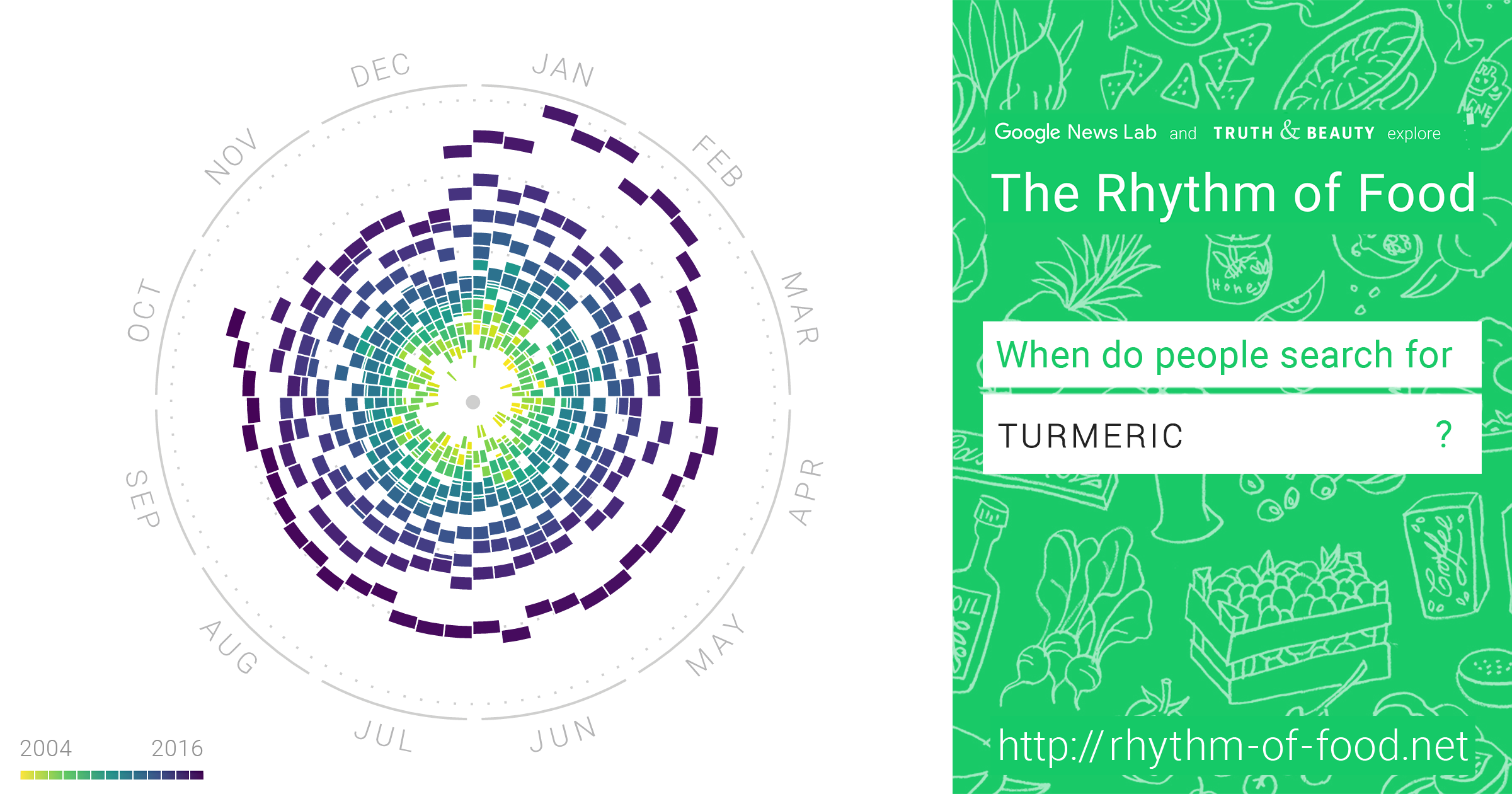
Powerful data visualization has the potential to translate dense information into elegant vehicles for storytelling. With the help of data visualization expert Moritz Stefaner of Truth & Beauty, the Rhythm of Food allows users to discover the interplay between seasons, years, news cycles, holidays and cultural events. In an interview with WIRED, Stefaner explained his process: Beginning with linear graphs of keyword trends, the designer discovered patterns that emerged season-by-season, year-to-year. “That’s when I got hooked on the idea of looking into seasonality,” Stefaner says. The year clock became an elegant solution to wrangle 12 years of data and 130,000 data points into a layered map of the ebbs and flows of time and popularity.
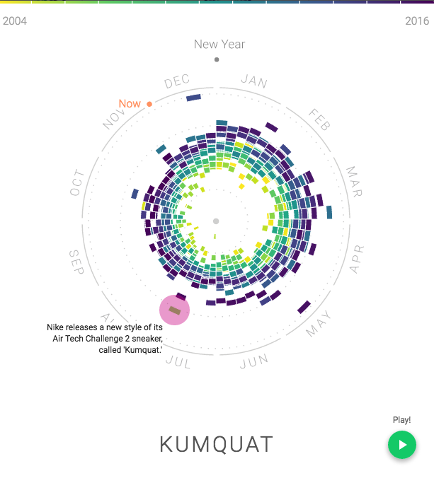
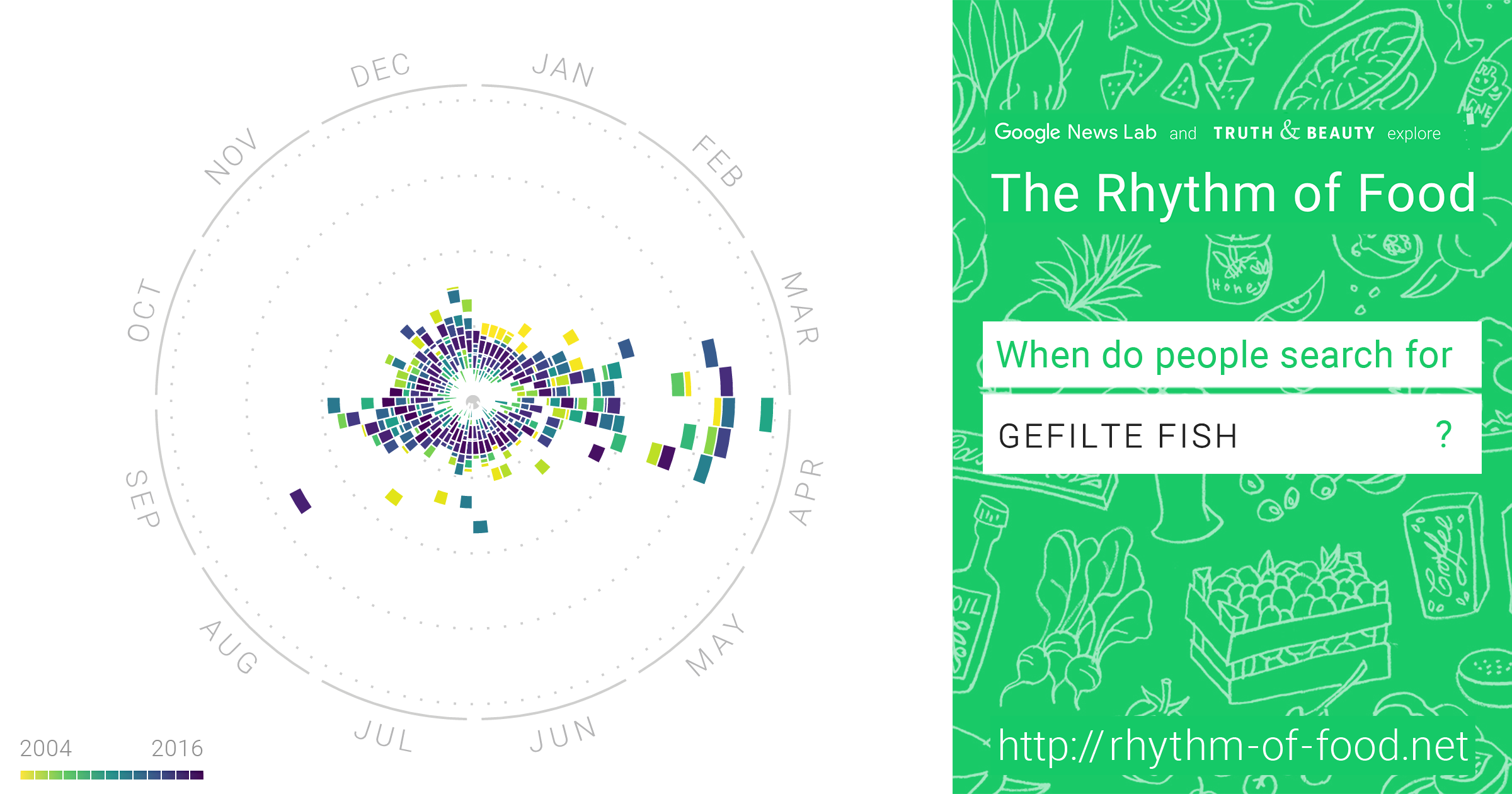
Some of our favorite food stuffs mapped by the Rhythm of Food include winter-ready dishes like Chili con Carne, the creeping seasonal appeal of the Pumpkin Spice Latte (since 2011, the season seems to arrive earlier and earlier) and Nike’s global influence mapped by the release of the ‘Kumquat’ sneaker in July 2006. The search for hot dogs peak around July 4th and Halloween because “Americans love to eat hot dogs on July 4th and dress up like hot dogs for Halloween.” There’s even a filter on the site that allows you to explore ‘Charts that look like the food.’ The clear winner? Gefilte Fish.
Stefaner has a history of translating big data into tasty, bite-sized morsels. The designer is also one of the people behind Data Cuisine, a culinary project that transforms the drab world of statistics and numbers into edible infographics. Launched as an open data cooking workshop in Helsinki 2014, Stefaner and Dr. Susanne Jashko of prozessagenten used the language of conventional data visualization theory—set lines, shapes, color, and orientations—in their plating and presentation but with the added dimension of flavor, texture and temperature of food.
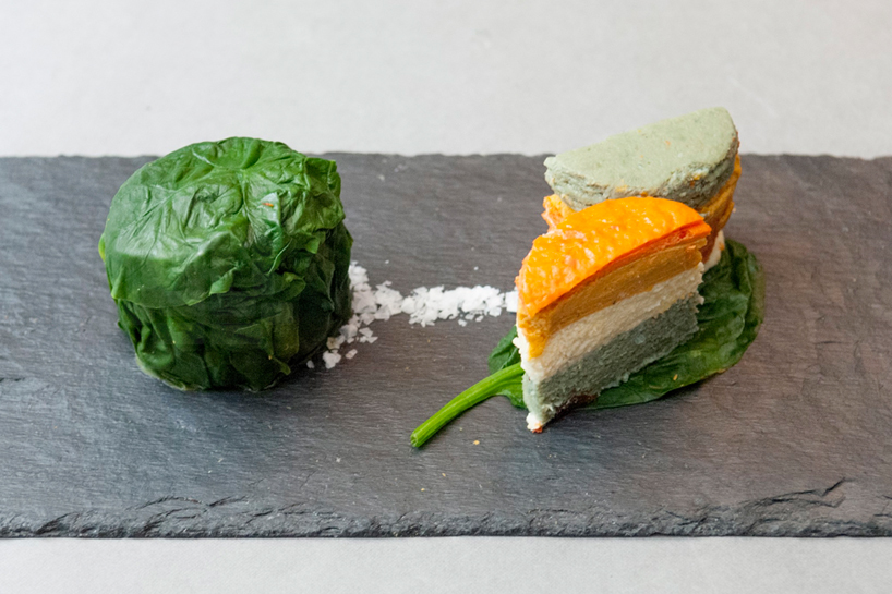
In one dish, a deconstructed Spanish tortilla tower represented the difference between Spain’s ranking on the “Better Life Index” and the way its own citizens prioritize civic markers—community with red pepper, life satisfaction with asparagus, jobs with potatoes and education with onions.
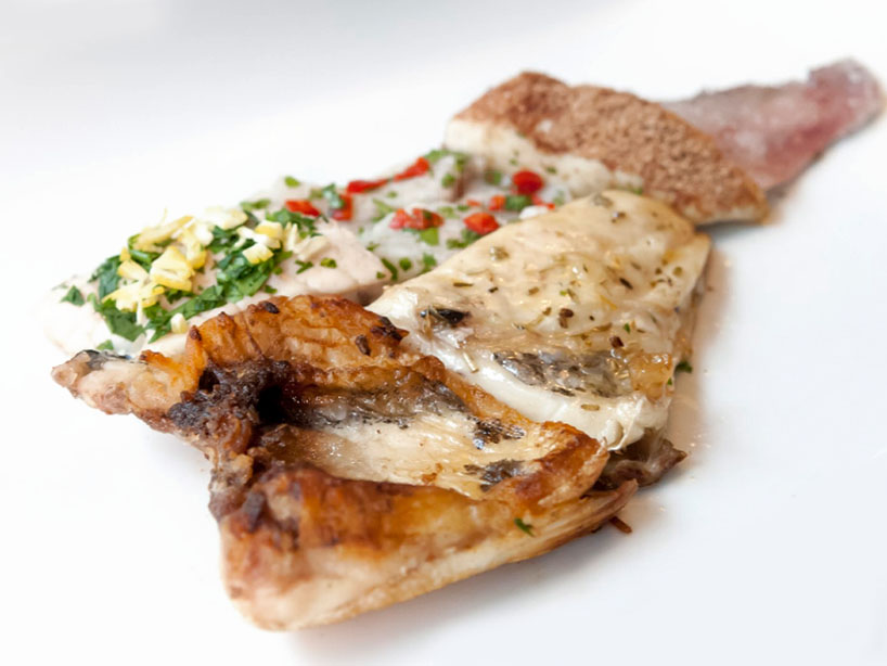
An “Emigration Fish” prepared six pieces of a single filet of fish in six styles to represent the cuisines of the countries most favored by young spaniards to emigrate to—battered for the UK; a wien sauce á la française for France; cooked in beer and parsley for Germany; fried in bacon fat for the US; and a ceviche prepared for Ecuador.
The Rhythm of Food reveals some wonderful things about what and when we eat but the more interesting answers to the hows and whys we search for food are revealed through the lens of culture—something that is not easily mapped with big data. The most fascinating part of the project is revealed in the form of the annotated entries, a reminder of the unpredictable beauty of the human hand.